How to Design Custom T-Shirts That Make A Statement

Designing custom tshirts is more than simply slapping a logo or slogan onto the shirt. To make an amazing tshirt, you must have a great design that grabs attention, starts conversations and gives off a positive vibe or brand message.
Whether you are designing a t-shirt for a corporate event or something more special and personal, a great design that keeps the users in mind can make a big impact!
Learn how you can create attention-grabbing tshirts by reading the insights and best practices in this blog post.
The Power of a Well-Designed T-Shirt
A well-thought out and designed custom t-shirt can be multi-purpose. A great custom tshirt for your brand should turn heads, demonstrate the culture of your business and should reflect your brand.
A great tshirt design will leave a lasting impression and help you stand out in a crowd.
Read More: How Custom Tshirts & Apparel Can Boost Brand Awareness
Why Design Matters for Custom Apparel
For businesses, a unique and eye-catching t-shirt design can be a powerful marketing tool, enhancing brand recognition and conveying the intended message effectively.
For personal or event-related t-shirts, a thoughtful design contributes to memorable moments and ensures people perceive the intended fun, serious, or professional tone.
Setting the Tone for Your T-Shirt Design
The colors, fonts , image and visual elements can drastically change the tone of your custom tshirt. You should pay special attention to these elements and ensure that it aligns with the goal and purpose of the shirt.

Custom TShirts
Choosing the Right Colors
The color of your custom tshirt fabric and the design elements can make a huge difference on how people perceive your message. Learn how different colors plays a psychological role on the perceptions of your audience.
Color Palettes That Align with Your Purpose
Choose colors that reflect the message and vibe you want to send: vibrant, bold colors for an energetic feel, or neutral, muted tones for subtle, professional looks. If you’re designing for a brand or organization, consider using your brand colors to strengthen identity and recognition. Avoid overwhelming combinations by sticking to a cohesive palette of 2-3 colors that work well together.
Understanding Color Psychology in Design
Red is for passion and energy, making it perfect for bold statements, blue is for trust and calmness,, making it perfect for . Yellow and orange convey warmth and friendliness, ideal for casual or playful designs. Neutral tones like black, white, and grey can balance brighter colors and provide a sleek, minimalist look.
Color Contrast for Readability and Visual Appeal
Ensure there’s enough contrast between the text and background to maintain readability—light text on a dark background or vice versa tends to be best. High-contrast color combos can create a dynamic, attention-grabbing effect. On the other hand, complementary can create striking visuals.
Selecting Fonts That Speak:
Once you have an idea of the colour palette you wish to use for your custom tshirts, its time to think about what fonts you may want to use if you expect to use typography on the shirt. You should think about choosing fonts that align with your brand message, carefully choose the size of the fonts and even consider combining multiple fonts to make your message even more impactful. Let’s jump in.
Choosing Fonts That Align with the Message
Playful fonts like hand-drawn or script styles work well for casual, creative t-shirts, while serif fonts suggest tradition and professionalism. Bold, heavy fonts command attention and work well for slogans or statements, while lighter, thinner fonts offer a more elegant look. Ensure that the font choice aligns with the tone of the t-shirt, whether it’s fun, serious, or business-oriented.
Font Sizing and Legibility on Fabric
Larger font sizes are essential for readability, especially if the text is a primary feature of the design (e.g., a slogan or quote). Avoid overly intricate or small fonts that may not translate well onto fabric, as they may become unreadable or blurred during printing. Consider spacing (kerning) between letters to improve clarity, particularly on curved or fitted areas of the t-shirt.
Combining Multiple Fonts Effectively
Pair contrasting fonts—one bold and one simple—for an engaging design without overwhelming the viewer. Limit font combinations to two styles to maintain a cohesive look; too many fonts can make the design feel chaotic and unprofessional. Experiment with font hierarchy to emphasize important words or phrases, using different sizes, weights, or styles.
Imagery that Leaves an Impact
The last step is to find the imagery/ graphics to select for your shirt. You should be choosing a visual graphic/ design that matches the theme of the shirt, supported by following best practices regarding sizing and placement on the shirt and ensure the quality of the image works with your shirt.
Selecting Imagery That Matches the Theme
Choose imagery that supports the overall theme or message of your t-shirt; for example, a nature-themed design might feature leaves, mountains, or animals. For branding purposes, use icons or visual elements that align with your business or cause, ensuring consistency across your designs. Ensure the imagery resonates with your audience, whether it’s fun, inspirational, or thought-provoking.
Best Practices for Image Placement and Scaling
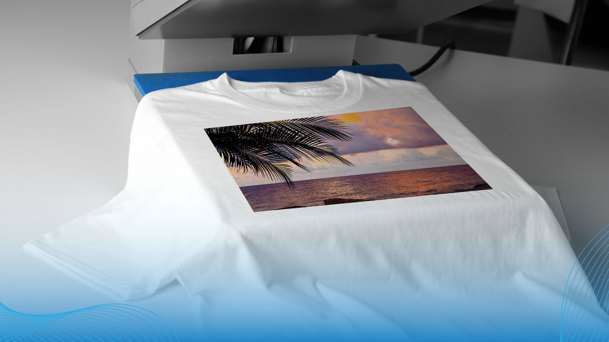
Position imagery in a way that balances the overall design—centered designs work well for simplicity, while off-center placements can create a more dynamic look. Consider scaling images appropriately; large designs work well on the front or back, while smaller designs are ideal for sleeves or the chest area. Ensure that image quality is high resolution to avoid pixelation or blurriness when printed on fabric.
Incorporating Logos, Illustrations, or Photographs
If using a logo, make sure it’s clearly visible and properly scaled, keeping the surrounding design elements simple to allow the logo to stand out. Illustrations add a custom, artistic feel to your t-shirt and can be tailored to reflect personal or brand-specific themes. Photographs can be striking, but they should be high-quality and relevant to the design’s theme, with proper color balance for fabric printing.
READ MORE: Custom Tshirts For Canadian Holidays: Celebrate Canada
Summary
Creating a memorable t-shirt design starts with selecting the right colors, fonts, and imagery. They should work together seamlessly to convey your message or theme. Here’s a quick recap of the key points:
- Colors: Choose colors that evoke the right emotions and fit the theme.
- Fonts: Select fonts that are readable and align with your design’s mood.
- Imagery: Use images and graphics that enhance and reinforce your t-shirt’s message.
Experiment with different combinations to find the perfect fit for your message or brand. Remember, a well-designed t-shirt can serve as a powerful medium to express individuality or promote a business.
Design Your Own Tshirts at Printwell
Unlock your creativity with Printwell’s user-friendly design tools and professional-quality printing services. Whether you’re looking to express your unique style or promote your brand, Printwell.ca offers customizable options to bring your vision to life.
Start your custom t-shirt design with Printwell.ca today and make a statement that’s uniquely yours!


