 A Proud Canadian Company
A graphic can be large and still miss its mark if it’s hard to read from where people will see it. Large format printing uses large, high-quality print machines to produce oversized graphics, often as one cohesive image rather than separate pieces assembled together. The setting, viewing distance and colour choices all shape the result.
It is natural to focus first on the image or message, but the material, scale and finish matter too. Whether the print is for a storefront, event space or another business setting, a clear plan helps it look professional and communicate at a glance.
Here, you’ll learn how large format printing works and what to consider when choosing banners and business graphics for indoor or outdoor use. We’ll look at how viewing distance affects design, why colour contrast matters and how to match a print to its setting. These practical considerations help you decide what your graphic needs to do.
Key Takeaways
- Understand how oversized printing turns artwork into cohesive graphics for business and promotional use.
- Choose banner materials and formats with the display setting and intended use in mind.
- Explore how graphics can support visibility in retail spaces, at events and in other business settings.
- Make text, contrast and colour choices that suit the distance your audience will view the graphic from.
- See how Printwell Canada’s custom apparel and DTF printing offerings can complement business branding.
How Does Large Format Printing Work?
Large format printing turns prepared artwork into oversized business and promotional graphics. Large-format printers can produce one cohesive image instead of separate sections assembled together.
Materials, Sizes, and Formats
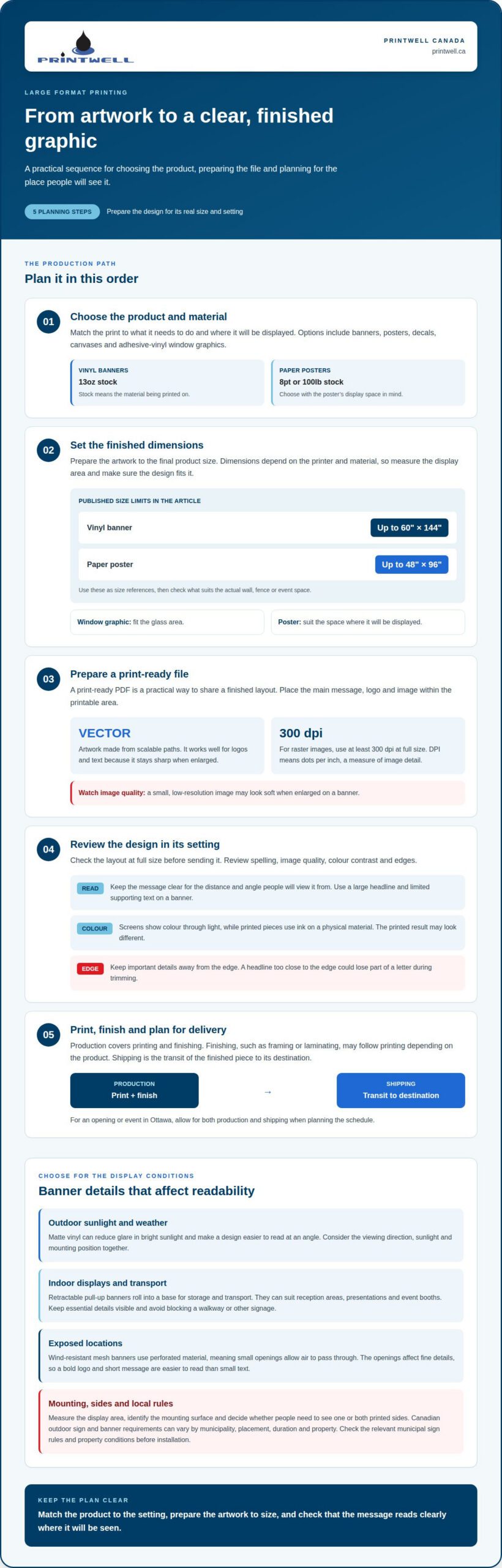
Start by matching the material to the product and its display setting. Common applications include banners, posters, decals, canvases and adhesive-vinyl window graphics. Vinyl banners use 13oz stock, where “stock” means the material being printed on. Paper posters may use 8pt or 100lb stock.
Dimensions depend on the printer and material, so prepare artwork to the finished size. A window graphic must fit its glass area; a poster should suit its display space. “Large format” and “wide format” are often used for oversized printing. Terminology can vary, so focus on the product dimensions and intended use.
Artwork File and Colour Requirements
A print-ready PDF is a practical format for sharing a finished layout. Vector graphics, artwork made from scalable paths, work well for logos and text because they stay sharp when enlarged. For raster images, use at least 300 dpi at full size. DPI means dots per inch, a measure of image detail.
Plan colours with the printed result in mind. Screens show colour through light, while printed pieces use ink on a physical material, so they may look different. Keep logos and text clear, with enough contrast for the intended viewing distance. These choices help large format printing reproduce a design that reads well in its setting.
Preparing Artwork for Print
Set the document to the finished product dimensions before exporting it. Place the main message, logo and image within the printable area, then review the layout at full size. A vector logo stays crisp when enlarged; a small, low-resolution image may look soft on a banner.
Review spelling, image quality, colour contrast and edges before sending the file. For example, a poster with a headline close to its edge could lose part of a letter during trimming. Correct sizing and a clear layout help the printed piece match the intended design.
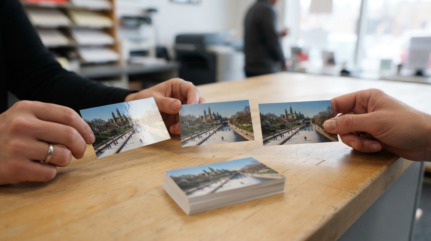
Large format printing can also produce many smaller items, including business cards. Finishing, such as framing or laminating, may follow printing, depending on the product. Production covers printing and finishing; shipping covers transit to the destination. For Ottawa businesses, allow for both stages when planning around an opening or event.
The process follows a practical sequence: select the product and material, prepare artwork to size, review the file, then print and finish the piece. A banner, poster and window graphic each need a layout suited to their use. Careful preparation gives the printer a clear target and helps the finished graphic communicate effectively.
For a project that combines display graphics with printed materials, plan your poster or foam board project around its dimensions, setting and intended message.
Oversized indoor and outdoor banners
A banner’s setting shapes its material, size and format. Indoor displays often need to fit a wall or event space, while outdoor banners face changing light and weather. Decide where people will see the message, how it will be mounted and whether it needs to be viewed from both sides.
Dimensions help you plan for a specific display area. Vinyl banners are listed up to 60" × 144", while paper posters can reach 48" × 96". Use these limits as a reference when considering a wall, fence or event space, then plan the layout to fit the available area.
For outdoor use, matte vinyl can reduce glare in bright sunlight and make the design easier to read at an angle. Keep the message clear, with a large headline and limited supporting text. A banner beside a busy entrance, for example, needs to communicate quickly to people passing by. Consider the viewing direction, sunlight and mounting position together.
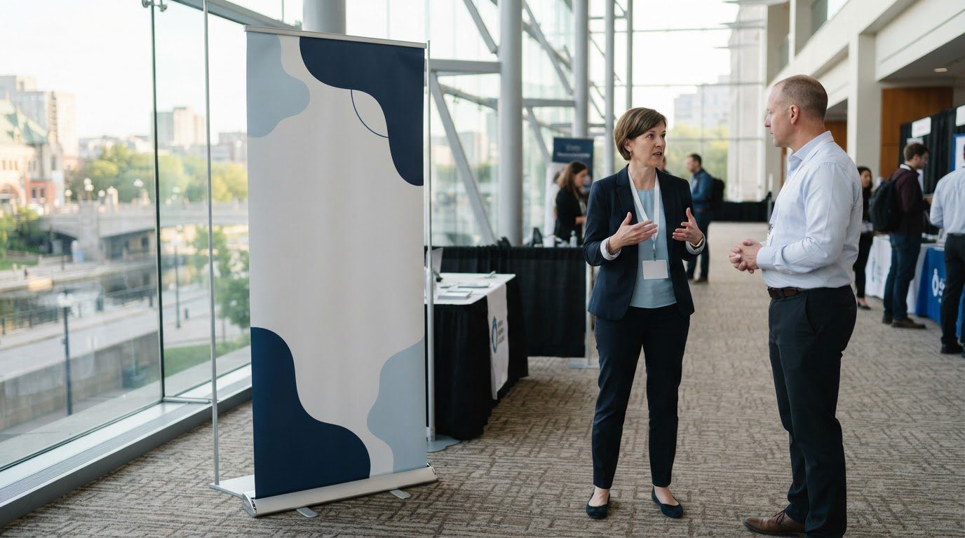
Retractable pull-up banners roll into a base for storage and transport. They suit indoor settings such as reception areas, presentations and event booths, where a freestanding display can sit near the audience. Use a clear headline and keep essential details visible. Position the banner so it fits the space without blocking a walkway or other signage.
Wind-resistant mesh banners use perforated material, meaning small openings allow air to pass through. This can suit exposed placements, such as a temporary fence. The openings affect how fine details appear, so a bold logo and short message are easier to read than small text. Design for the viewing distance and angle.
Canadian outdoor sign and banner requirements can depend on the municipality, placement, duration and property. A banner attached to a building may be treated differently from one displayed on a temporary fence. Review the applicable municipal sign rules and property conditions before installation, especially for a public-facing site or a display near a roadway.
Before choosing a format, measure the display area, identify the mounting surface and decide whether the graphic needs one or two printed sides. Banners can be single-sided or double-sided, depending on how people approach them. For an Ottawa storefront or event, signs and banners offer a practical starting point for planning a display that fits its setting.
Retail, event, restaurant, construction and vehicle graphics
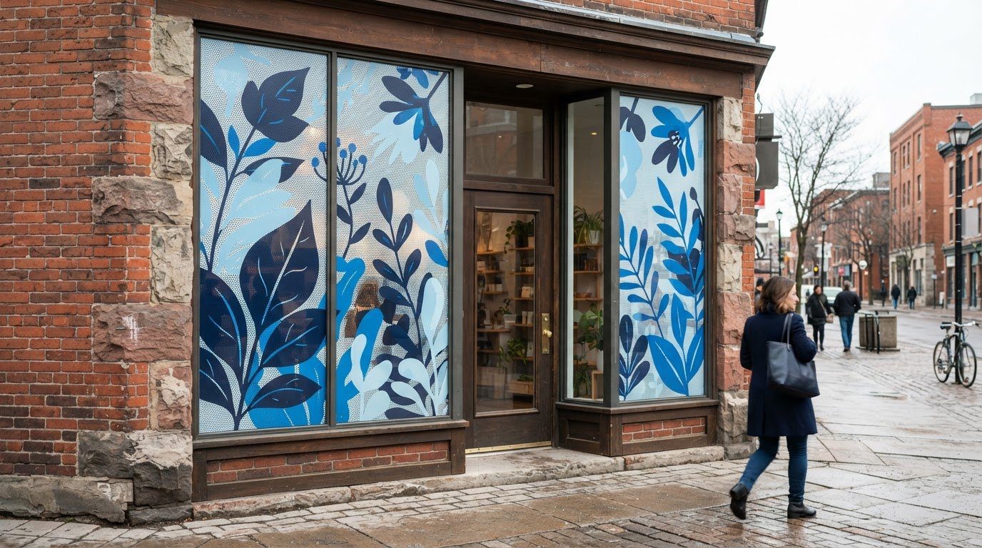
Business graphics work best when each piece has a clear role. A retail sign can identify a storefront, restaurant graphics can communicate a featured message, and construction signage can help visitors locate an entrance. Vehicle graphics carry a business identity between locations. In each setting, make the business name or main message easy to recognize first.
For a retail space, place graphics where customers naturally look, such as near an entrance or beside a featured product area. A restaurant might use a poster to highlight a menu special, while a construction site could use a sign to direct visitors toward a site office. Match the amount of information to how long people are likely to look.
Vehicle graphics are often seen while people are moving, so a short business name and a clear logo are easier to take in than a block of small text. Construction graphics have a different task: they can identify a project or guide people around a site. Consider where the audience will stand, what they need to notice and what nearby activity could distract them.
Event and Exhibition Signage
At an event or exhibition, signage can identify entrances, registration points and activity areas. Use a consistent visual style across the main display and supporting signs, so visitors can connect each piece with the same organization. For example, a registration sign should make the check-in point easy to find without competing with the event’s central display.
Plan each graphic for its location within the venue. A sign near an entrance may need to introduce the event, while one beside a presentation area can identify a session. Keep directions brief and place them where arriving visitors can see them before choosing where to go.
Trade Show Signage
At a trade show, graphics help a booth stand out among other exhibitors. Put the business name and central message where they are visible from the aisle. Supporting details can sit closer to the display, where visitors have time to read them. This gives passersby a quick introduction without overcrowding the booth.
Use a shared logo, colour palette and headline across related booth graphics. For example, a backdrop can introduce the business while a nearby sign highlights a service or product. Visitors can then recognize the same identity across each piece, even as they move through a busy exhibition floor.
Pop-up events call for graphics that suit temporary spaces, including market tables, product launches and community gatherings. A freestanding sign can introduce the business, while smaller signs label products or direct visitors. Give each graphic one purpose instead of squeezing every detail onto a single display.
Before production, map the visitor’s path from the entrance to the display. Decide what people need to find first, where they may pause and which message deserves the most attention. A restaurant promotion may lead with a featured item; a trade show display may lead with the business name. This planning gives each graphic a specific job.
Viewing distance and colour contrast
A graphic needs to work from the place people will actually see it. Before finalizing a design, identify the audience’s position, the viewing angle and any competing visual details. A poster beside a reception desk may be read up close, while a banner above an event entrance needs a headline people can recognize from farther away.
Distance changes how much detail viewers can comfortably read. Keep the main message short, use a large headline and give important text space around it. For example, a storefront sign can lead with the business name, while opening hours or a short offer remain secondary. Avoid relying on small text to explain the main point.
Contrast helps separate lettering from its background. Dark text on a light field, or light text on a dark field, can make a message easier to distinguish. A pale yellow headline over a white background may blend in, especially under bright lighting. Review the full design at its intended display size, not only on a phone or computer screen.
Colour also depends on the viewing environment. A design beside a sunlit window may look different from the same artwork under indoor lighting. Nearby wall colours, reflective glass and the print material can affect how the graphic appears. Keep the palette focused, and use the same brand colours across related signs, posters and display pieces.
Colour consistency means keeping colours visually aligned across separate printed items. A matching logo on a poster and a table display helps people connect both pieces with the same business. A screen preview is useful, but it shows colour through light; printed ink appears on a physical surface. Consider the material and lighting together when planning the finished look.
Custom full-colour table covers can make an event table part of a coordinated display. A logo centred on the front panel may be visible to visitors approaching from the aisle, while a busy pattern can compete with products placed on top. Plan the artwork around the table’s shape, the visible sides and the items that will sit on it.
Finishing choices can also change how a graphic looks and functions. Lamination is a protective layer applied over a print; it can alter the surface’s sheen. Framing can give a poster a defined edge and support its presentation on a wall. Select a finish based on the display setting, surrounding light and how the piece will be handled.
Before printing, review the headline, contrast and brand colours together at the intended size. Then consider finishing, such as lamination or framing, as part of the final presentation. This sequence helps the message stay clear across a poster, window graphic or event display.
How large format printing works
A successful print project moves through connected steps, from defining the display’s purpose to inspecting the finished piece. Each decision affects the next: a poster for a reception area needs a different layout and finish from a banner meant for an event entrance.
First, the printer needs the product type, finished dimensions, material and intended use. These details guide the file setup and production method. For example, a poster designed for a wall display needs artwork proportioned to its final shape. Changing the dimensions after layout can crop important text or leave unexpected blank space.
Next comes artwork preparation. The file is checked for size, image quality, colour and layout issues before it goes to the printer. This review is called preflight, meaning a check that the file is ready for production. It can catch a missing font, an image that appears blurry when enlarged or a logo placed too close to an edge.
The approved file is then processed by the printer’s software. A raster image processor, or RIP, translates artwork into instructions the printer can use. It maps the image onto the selected material and controls how the design is reproduced. This step connects the digital file to the physical print, rather than simply enlarging an image on screen.
During printing, the material feeds through the machine as the image is applied. The printer’s settings and the material work together to reproduce the artwork. A photograph, for example, relies on smooth colour transitions, while a text-heavy poster needs crisp lettering and clear contrast. The original file and intended viewing conditions both influence the result.
After printing, finishing prepares the piece for its intended use. Depending on the product, this may involve trimming, laminating or framing. Trimming brings the print to its finished edges; lamination adds a protective layer. The final inspection checks that the image, edges and finish match the order before packing.
Production time and shipping time are separate stages. Production includes printing and any finishing, while shipping covers transit to the destination. The schedule depends on the product, file readiness, finishing steps and delivery location. For Ottawa orders, allow time for both stages when planning around an opening, event or promotion.
The clearest takeaway is to settle the purpose, dimensions and material before artwork is finalized. That gives the file a defined target and reduces changes between design and production. To turn a display idea into a finished print, plan your poster or foam board project with those details in mind.
Printwell Canada
Printwell Canada helps Ottawa businesses carry a consistent visual identity across printed materials and branded apparel. If a campaign includes a large display alongside clothing for staff or event teams, coordinate the colours, logo and message so each piece feels connected.
Custom T-shirts, embroidered hoodies and hats can help teams look unified at a launch, trade show or community event. Direct-to-Film (DTF) stickers and films use a printed design transferred onto a surface, offering another way to apply branded artwork to suitable projects. The right combination depends on where the pieces will be used and how your business wants its identity represented.
Bring your project goals and artwork details together, then consider which printed or branded pieces will support them. Contact Printwell Canada to discuss your large format printing project in Ottawa.
Give Your Next Display a Clear Purpose
A strong print project starts with a clear job: help people notice your business, find their way or remember a message. Before moving ahead, decide what you want viewers to do after seeing the graphic. That goal can guide the format, wording and supporting materials without adding unnecessary detail.
For Ottawa businesses, large format printing can anchor a wider brand presence. Custom T-shirts, embroidered hoodies and DTF stickers and films can help carry that identity into staff apparel or event materials. Each piece should support the same message while fitting its own setting and use.
When you’re ready to shape a project around your business, contact Printwell Canada about your project. Share what you’re hoping to communicate and where the finished materials will be used. A clear starting point makes it easier to move from an idea to purposeful printed pieces. Your next display can make your message easier to see and remember.
Frequently Asked Questions
What’s the largest size I can order for a vinyl banner or paper poster?
The listed maximum is 60" × 144" for a vinyl banner and 48" × 96" for a paper poster. Use these dimensions to plan a storefront display, event backdrop or wall poster. Measure the display area and account for how the print will be mounted. Keep the main message within the visible area so it remains clear once the piece is installed.
What is large format printing and what sizes does it include?
Large format printing uses specialized printers to create oversized graphics, including banners, posters and signs. There is no single size boundary that applies to every printer or product. Dimensions depend on the equipment, material and finished item. For example, a poster for an office wall may be smaller than a banner for a building frontage. Choose a size suited to the display space and viewing distance.
What materials and finishes are available for large format printing?
Materials can include vinyl for banners and paper for posters, with finishing selected for the intended display. Trimming creates the finished edges, while framing supports a poster’s presentation on a wall. Lamination adds a surface layer to the print. The location, handling and appearance you want all influence the best material and finish for the project.
How much does large format printing cost in Canada?
Pricing depends on the item, dimensions, material, quantity and finishing. A large banner uses a different amount of material than a small poster, and added finishing can involve more production work. Artwork requirements may also affect preparation. To define your project, identify the product, required quantity and display setting. Those details help establish what the job involves without relying on a generic price range.
How long does large format printing take in Canada?
Production and delivery are separate stages, and the schedule depends on the product and destination. Production includes printing and any finishing; shipping covers the time in transit. A ready-to-print file may move through production differently from artwork that needs changes. For an event or store opening, plan around both stages and the date the printed piece must be in place.
What are the best options for banners, posters, signs, and trade show displays?
Choose a format that fits the display’s purpose. A banner can span a larger area, a poster can present information on a wall, and a roll-up banner suits a portable trade show display. Foam board offers a firm surface for presenting graphics. For a booth, consider how visitors approach the display and make the business name and main message easy to notice.
What are the durability and weather resistance of large format prints?
Durability depends on the material, finish, placement and exposure. An indoor poster faces different conditions from an outdoor banner exposed to sunlight, moisture and wind. Select materials for the intended setting and consider a protective finish where suitable. Secure mounting and careful storage between uses can also help keep a display in usable condition. No single material suits every location or application.