
 A Proud Canadian Company
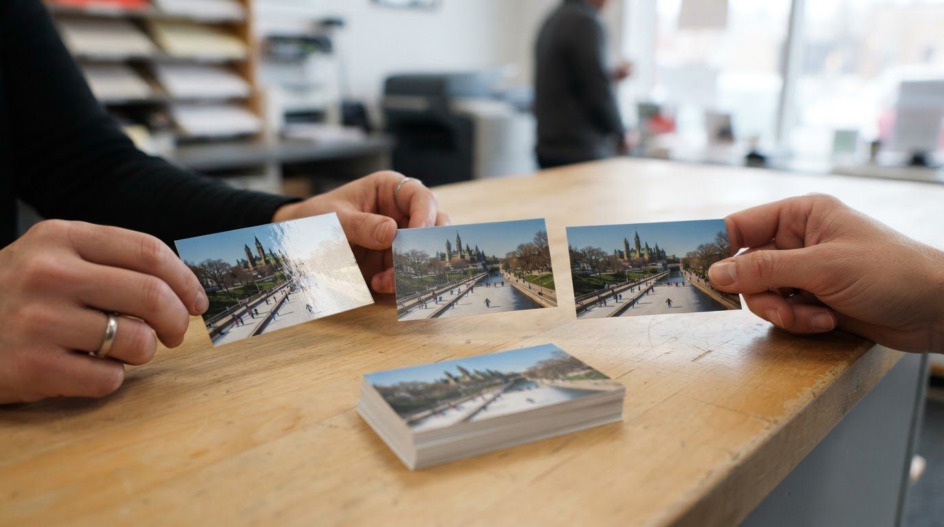
For photo-heavy business cards, coated stock is a strong choice because its smooth surface reproduces fine details clearly. Choosing the right paper for business cards also means matching the finish to the image: gloss can make colours look more vivid, while matte offers a smooth, non-shiny look. A stock weight of 300-350 GSM is a practical starting point for a professional card.
A photo can look sharp on screen yet appear different on paper. The finish affects shine and colour, while the paper’s thickness changes how sturdy the card feels in someone’s hand. When choosing the right paper for business cards, look beyond appearance alone.
This guide explains how coated and uncoated stocks affect photos, how gloss, matte, satin, and soft-touch finishes change the result, and what recycled paper can communicate about your brand. You’ll also learn how thickness, card size, and print-file setup work together, so you can choose paper that suits your business and prepare artwork for a clean, readable print.
Key Takeaways
- Match the paper’s texture and finish to your brand’s personality and the way you plan to hand out your cards.
- Choose uncoated stock when people may need to write on the card, keeping in mind that colours can appear more subdued.
- Consider recycled paper as a way to support a sustainability-minded brand identity.
- Use the standard 3.5-by-2-inch size to make cards easy to store in wallets and cardholders.
- Keep contact details clear and readable, and prepare your print file with the chosen stock and finish in mind.
What type of Business Card paper should I use for photos?
For photo-heavy cards, coated stock gives images a smooth surface and clear detail. A professional result comes from matching the finish and paper weight to your brand identity.
Stock and Finish Choices by Use Case
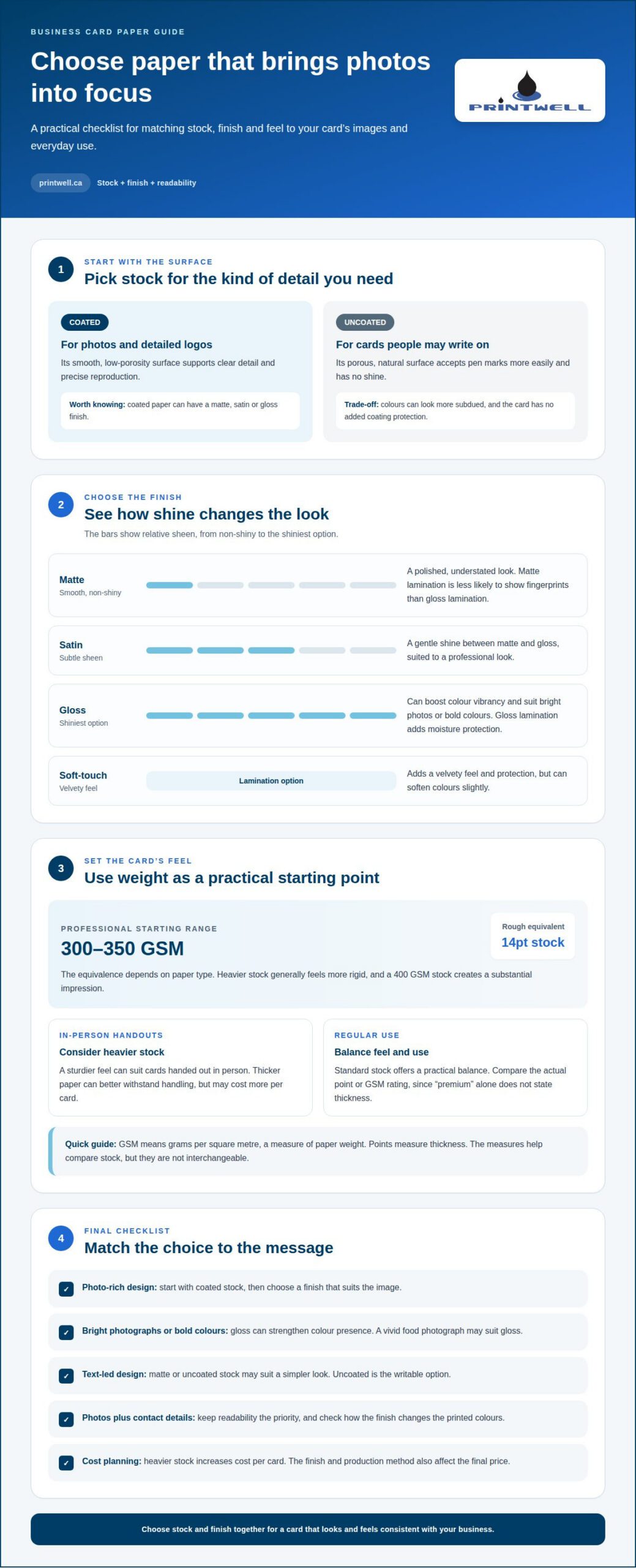
Stock is the paper used to make a business card, and its weight affects firmness. For photo-rich cards or detailed logos, coated paper’s smooth, low-porosity surface supports precise reproduction. A 14pt stock is roughly equivalent to 300-350 GSM, depending on paper type. GSM means grams per square metre, a measure of paper weight.
Choose based on how the card will be used. Cards handed out in person can benefit from heavier stock that feels sturdy. A 400 GSM stock creates a substantial impression, while 300-350 GSM offers a practical professional starting point. For a card people need to write on, uncoated paper has a porous surface that accepts pen marks more easily.
Weight and finish also affect printing prices in Canada. Heavier stock increases the cost per card, while the chosen finish and production method also shape the final price. A specific price depends on the stock and finish selected.
Matte, Satin, Glossy, and Uncoated Finishes
A finish describes the card’s surface appearance and feel, so it influences how photos and colours come across. Matte is smooth and non-shiny, giving a restrained, polished look. Satin has a subtle sheen between matte and gloss. Gloss is the shiniest option, boosting colour vibrancy and adding protection.
For a professional look, choose matte for an elegant, understated card or satin for a gentle sheen. Gloss can suit bright photographs and bold colours. Uncoated stock has a natural, non-reflective texture and is easy to write on, but colours can appear more subdued. Keep readability the priority, especially when photos share space with contact details.
Coated paper can have a matte, satin, or gloss finish. Coated paper can have a smooth surface, and a varnish layer may offer some resistance to stains and tears. Matte lamination is less likely to show fingerprints than gloss lamination.
Paper and Coating Options from Canadian Printers
Canadian printers offer coated and uncoated stocks, with matte, satin, and glossy finishes available for coated cards. Recycled paper is another option for businesses that want their printed materials to reflect sustainability values. The best fit depends on your brand, image content, and whether people will write on the card.
Soft-touch lamination adds a velvety feel and protection, but it can soften colours slightly. Gloss lamination gives photos stronger colour presence and protects cards from moisture. Uncoated paper offers a natural, writable surface without shine, though it lacks the added protection of a coating.
Match the material to the message: a vivid food photograph may suit gloss, while a simple text-led design may work well on matte or uncoated stock. Choosing stock and finish together helps your card feel consistent with your business.
Comparing gloss, standard, premium, and extra-thick stocks
In Canada, common business card stocks include 14pt and 16pt options, with standard stock often ranging from 250 to 400 GSM. Compare the paper’s weight, coating, and feel together, because no single measurement describes the whole card.
Grammage, Thickness, and Rigidity
Grammage measures paper weight in grams per square metre, while points measure thickness. These measures help you compare stocks, but they aren’t interchangeable. A 350 GSM business card is roughly equivalent to 16pt stock, and higher grammage generally makes paper thicker and more rigid.
A 14pt stock is 0.014 inches thick; 16pt stock is 0.016 inches thick. Those figures give a useful reference when comparing specifications. For a standard professional feel, 14pt to 16pt or 300-350 GSM is a common range.
Stock Feel and Durability
Stock feel describes the firmness and tactile impression a card creates in hand. A 14pt or 16pt card suits everyday networking, while 18pt stock and thicker feels more substantial and may cost more per card. Thicker paper can also better withstand handling, making it worth considering for cards handed out in person.
For sample comparisons, handle each option under the same conditions: feel its firmness, check how the coating affects the surface, and compare printed colours. A 350 GSM sample, for example, offers a useful reference point for balancing durability and bulk. Compare the printed result too, since the finish can change colour appearance.
A glossy finish adds shine and can boost colour vibrancy. Gloss stock is commonly recommended at 14pt-16pt, while the coating adds protection. Standard stock offers a practical balance for regular use; premium stock often feels heavier or has a more distinctive finish. The label “premium” alone doesn’t specify a card’s thickness, so compare its actual point or GSM rating.
Extra-thick business cards use stock from 18pt to 32pt or more. A 400 GSM card is approximately 18-24pt thick, depending on the paper type. These cards feel more substantial, but added thickness can increase cost per card. Consider how the card will be carried and shared before choosing a heavier option.
Choose based on use, not thickness alone. Cards left on a reception desk may not need the same rigidity as cards passed between people at events. If you’re ready to select a stock for your project, explore business card printing options.
Recycled paper and sustainable branding
Recycled paper can help businesses reflect sustainability values through a practical item customers handle. The stock should also support readable text, clear printing, and a brand impression that feels intentional.
Alternative-Fibre and Specialty Papers
Alternative-fibre and specialty papers use distinctive materials or surface qualities to give a business card a particular look and feel. They can help a brand stand apart while keeping contact details easy to read.
Recycled paper is an option for businesses seeking a more sustainable alternative. Specialty stocks can add a tactile detail, such as a noticeable texture, that supports a handmade or natural brand identity. Consider how the surface will work with your logo and text. A highly textured sheet may affect small details, so keep essential information clear and prominent.
Comparing Recycled and FSC-Certified Papers
Recycled paper describes the paper’s fibre content, while FSC-certified paper refers to certification connected with forest-based materials. These labels address different considerations, so one does not automatically mean the other.
For example, a business focused on using recovered fibre may prioritize recycled content. A brand emphasizing certified forest sourcing may look for FSC certification. Compare the paper’s visible finish and how the printed design looks, then choose the option that best reflects your priorities. According to Nielsen’s 2025 Global Sustainability Report, 68% of consumers prefer to buy from sustainable brands.
A sustainability message works best when the card’s design supports it. Use a restrained palette, clear type, and enough open space. For example, a local Ottawa food business could pair a simple logo with concise contact details, letting the paper contribute to the impression without crowding the design.
Print results depend on the stock’s surface, the ink, and the design’s detail. A smooth sheet can support crisp fine lines, while textured specialty paper gives a card a distinctive feel. Recycled stocks also vary in appearance, so colours that look bright on screen may appear different on paper. Keep key text high-contrast against the background.
Before selecting a stock, decide what you want the material to communicate: recycled content, certified sourcing, a distinctive texture, or a clean, smooth look. Then assess the design against that choice. A detailed photo or small logo calls for attention to print clarity, while a text-led card can make the paper itself more noticeable.
These choices help connect printed materials with a brand’s wider values. Recycled or specialty paper can contribute to a thoughtful first impression, but readability and accurate contact details matter most. Choose paper for the message it supports, not simply for a sustainability label.
Standard business card dimensions and print setup
A standard business card measures 3.5 by 2 inches, a compact format that fits common wallets and cardholders. Set the artwork to those dimensions before arranging photos, contact details, and brand elements.
Start print setup by choosing the card’s orientation, then build the layout within its edges. Keep names, phone numbers, and email addresses easy to scan. Leave breathing room around important details so the design doesn’t feel crowded. For example, place a logo beside the business name instead of squeezing it among several lines of contact information.
Check the finished design at actual size, not only enlarged on a screen. Small text can appear clear on a monitor but become difficult to read on a 3.5-by-2-inch card. Prioritize legibility over decorative details, especially when a photo or coloured background shares space with contact information. Strong contrast helps printed text stand out against the image.
Choose business card paper with the image and handling needs in mind. The recommended grammage is 300 g/m² to 350 g/m², where grammage means paper weight per square metre. This range suits a standard card, while higher grammage generally creates thicker, more rigid stock. A matte finish reduces shine, which can help keep text comfortable to read under bright lighting.
Recycled paper can support an eco-friendly brand identity, while stock texture contributes to the card’s overall impression. A smooth surface suits detailed photos and fine logo lines. A textured sheet can give a simple design more character, but busy backgrounds may compete with that texture. Match the material to the design, then check that names and contact details remain clear.
Consider writability and durability before settling on a finish. Uncoated paper has a porous surface that’s easy to write on, making it useful for appointment notes or personal messages. Coated stock offers added protection, while a glossy finish can help resist moisture. If recipients may write on the back, leave that area uncoated so pen marks take more easily.
Some home printers can handle lighter cardstock, but support for paper weights varies. Check the printer’s specifications before attempting a home print run. If it can’t handle the chosen stock, the paper may feed poorly or print unevenly. Matching the file dimensions, text size, paper weight, and finish helps create a card that looks considered and works well in everyday use.
Choosing paper for a specific business
Choosing the right paper for business cards means connecting material, finish, and brand personality. Ask whether the card feels consistent with the service it represents, from an Ottawa neighbourhood café to a financial adviser.
For a photographer, florist, or bakery, images and colours may be central to the design. Coated stock with a glossy finish can bring colour forward, while a matte surface gives photos less shine. Keep the business name and contact details clear beside the image. A strong photo should support the message, not compete with it.
A consultant, accountant, or other text-focused professional may prefer a quieter impression. Matte stock keeps glare low and looks polished; uncoated paper feels natural and accepts handwriting. If clients often receive handwritten notes, that writable surface can be especially useful. Choose clear type and enough contrast instead of relying on decoration to stand out.
For a craft business, studio, or independent maker, texture can help express personality. Uncoated or specialty paper may feel more natural and tactile than a smooth coated sheet. Keep the design simple so texture doesn’t compete with fine lettering. A few carefully chosen colours and a distinctive logo can make the material part of the brand experience.
Premium services may call for a card that feels more substantial. A 400 GSM stock creates a weightier impression than a lighter sheet, while soft-touch lamination adds a velvety feel. Remember that this coating can soften colours slightly. For a restrained luxury look, pair a simple design with matte or soft-touch finishing, rather than adding effects that obscure essential details.
Sustainability-minded brands can consider recycled paper as part of their identity. It may suit businesses that want the card’s material to reflect environmental values, such as a local Ottawa refill shop or an organization focused on reuse. Consider the printed result as well as the paper’s message. Fine photo detail and small text need to remain clear on the chosen surface.
Before settling on a paper type, picture how the card will reach customers. A card left at a reception desk has different handling needs from one passed around at networking events. Match the material to the design: photographs need clear reproduction, handwritten notes need a writable area, and a natural brand may benefit from an uncoated texture. The best choice supports everyday use and the impression you want to leave.
Ready to put your choice into print? Explore business card printing for a card that reflects your business.
Printwell Canada: Business Cards
Printwell Canada prints business cards for Canadian businesses that want their paper, finish, and design to work together. Bring your chosen artwork and stock preferences into the order, whether you need cards for everyday introductions, client meetings, or an upcoming event.
A clear design direction helps connect business cards with other branded materials. Printwell Canada also offers custom T-shirts, DTF stickers and films, embroidered hoodies, and custom hats, helping businesses carry a consistent visual identity across different items.
Ready to turn your paper and finish choices into printed cards? Contact Printwell Canada to discuss your business card order.
Make your next card feel like your business
The final choice should feel like a natural extension of your brand, not a design trend borrowed from somewhere else. When choosing the right paper for business cards, consider what you want people to notice, remember, and keep. A thoughtful stock and finish can make that first exchange feel personal and intentional.
Printwell Canada brings the same visual identity to business cards and other printed pieces, including Custom T-Shirts, DTF Stickers and Films, and Embroidered Hoodies. When you’re ready to take the next step with your cards, contact Printwell Canada today.
Your business has its own character. Give it a card that feels true to it.
Frequently Asked Questions
What is the most durable paper for Business Cards?
For a sturdy card, choose heavier coated stock with a protective finish. A 400 GSM stock feels substantial, and gloss lamination, a thin protective layer applied to the printed card, adds resistance to moisture. The best combination depends on how the card will be handled: a card kept in a wallet faces different wear than one placed on a display counter. If people will write notes on it, leave that area uncoated.
Should I choose matte or gloss lamination for my business cards?
Choose matte lamination for a low-shine look and fewer visible fingerprints; choose gloss when you want brighter colours and a shinier surface. A photo-led card may benefit from gloss, while a text-focused design can feel more restrained with matte. Consider the lighting too: glare from a glossy surface can make small contact details harder to read in bright settings.
What’s the difference between Cotton and Eco Signature Business Cards?
Cotton describes a paper stock made with cotton fibres, while “Eco Signature” is a product label rather than a universal paper grade. Those names alone don’t establish recycled content, certification, weight, or finish. Compare the stated material and environmental details, then consider the surface and printed appearance. For a logo with fine lines, clarity and contrast should remain priorities.
Which business card finish is best for writing on?
Uncoated paper is generally the better choice for handwritten notes because its porous surface accepts pen marks more readily. It can suit appointment cards where staff add a time or follow-up detail. A coated or laminated surface may resist writing or cause ink to smear. If only one side needs notes, an uncoated reverse can keep the front design polished.
Are eco-friendly business cards considered professional?
Yes. Recycled paper can look professional when the design is clear, well-balanced, and suited to the brand. A clean logo, readable contact details, and thoughtful colour choices help the card feel intentional rather than improvised. A natural-looking stock can support a sustainability-focused business, while a polished layout keeps the focus on useful information. The material and presentation work together.
Can I use my own design on any paper?
You can bring your own design, but the same artwork may not look identical on every paper type. A textured surface can affect fine lines, while a paper’s colour and coating influence how printed colours appear. A pale logo, for instance, may lose contrast on a naturally toned stock. Set the layout to the finished card size and keep key details legible against the background.
What finish should I choose for a luxury brand?
Matte or soft-touch finishing can suit a luxury brand seeking a refined, understated feel. Soft-touch lamination adds a velvety surface, while matte keeps shine low. Thicker stock can reinforce that tactile impression, especially for cards exchanged in person. Keep the design uncluttered and let the material carry some of the character. Remember that soft-touch can slightly soften colours.
What paper weight and thickness are best for business cards?
For a standard professional card, 14pt to 16pt or 300-350 GSM is a common choice. Points describe thickness, while GSM measures paper weight, so treat them as related but different specifications. Choose thicker stock if a firmer feel and extra durability matter for frequent handling. For desk displays or bulk mailings, a lighter card may be more practical.