 A Proud Canadian Company
Pantone isn’t automatically the safer choice for every apparel design. When weighing CMYK vs Pantone for apparel printing, consider the artwork, garment and decoration method, not just how closely a colour matches on your screen.
It’s understandable to worry that a familiar brand colour could shift on a finished garment. A screen preview can’t promise an exact print match, and the colour system alone won’t determine the result. CMYK uses four process colours to reproduce full-colour images and complex graphics, while Pantone specifies pre-mixed spot-colour references for more controlled colour communication. The best fit still depends on how your design will be produced.
This guide will help you choose a colour workflow for your design and order, set realistic expectations before production, and prepare useful colour references and artwork files for your print provider. We’ll compare where CMYK and Pantone work well, explain how the garment and printing method can affect the finished appearance, and cover what to confirm before approving the artwork.
Key Takeaways
- CMYK vs Pantone for apparel printing is a choice between process-colour artwork and named spot-colour references, but the production method matters too.
- Consider the garment’s colour and fabric surface when setting expectations for how printed colours will appear.
- CMYK can be a practical starting point for multicolour imagery and gradients, but check the chosen process’s capabilities.
- Before ordering, confirm the garment and decoration method, share the original artwork, and identify any brand-critical colours.
- Printwell offers custom apparel printing, including DTF. Discuss your artwork and garment requirements to determine a suitable workflow.
CMYK vs. Pantone for apparel printing: what is the difference?
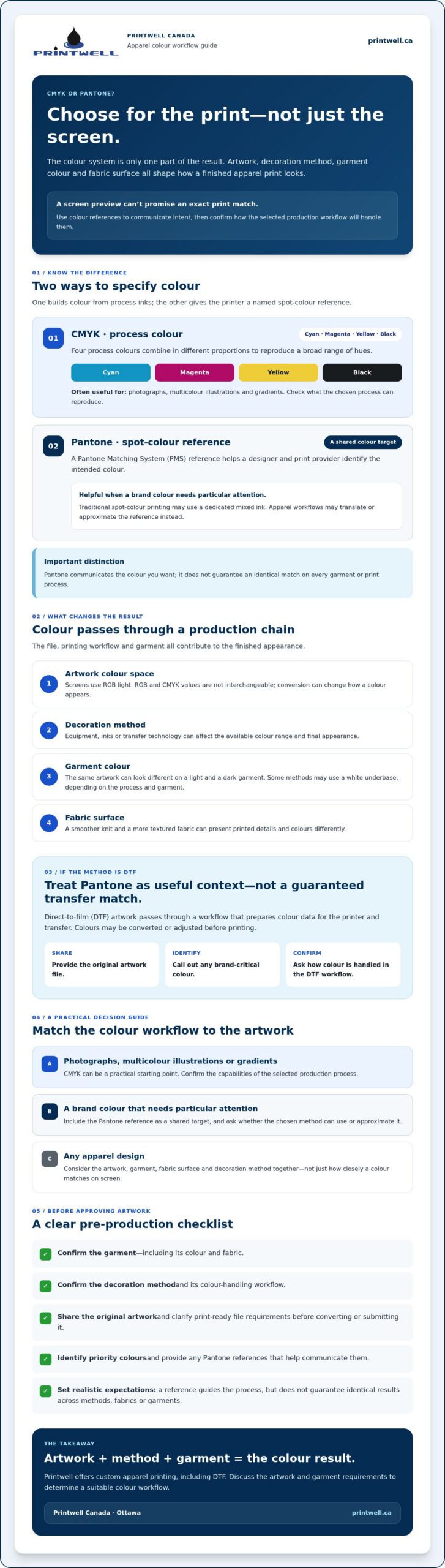
CMYK builds colours from four process inks: cyan, magenta, yellow and black. Pantone identifies a named spot-colour reference. For apparel, the colour specification is only one part of the decision. The decoration method, garment colour and fabric surface all influence how the finished print looks.
Process colour: Colour created by combining a set of process inks, such as CMYK.
Spot colour: A specific colour called for separately from the process-colour mix. It may be produced with a dedicated ink, depending on the print workflow.
Colour reference: A shared standard for communicating the intended colour, not a promise that every production method will reproduce it identically.
What does CMYK mean in apparel printing?
CMYK stands for cyan, magenta, yellow and key, or black. In process printing, these colours combine in different proportions to reproduce a broad range of hues. The CMYK color model explains the underlying four-colour process.
CMYK artwork can be useful for photographs, multicolour illustrations and gradients. Its numeric values specify colour for a production workflow, but they don’t guarantee an identical result on every garment. The available colour range and final appearance can vary with the equipment, inks or transfer technology, garment shade and fabric surface.
RGB is different. Screens create colour with red, green and blue light, so a design that looks bright on a monitor may not translate exactly to print. RGB values aren’t interchangeable with CMYK values. Converting between them can change how a colour appears, so confirm the print-ready file requirements with your provider before converting or submitting the artwork.
What is Pantone, and what does a Pantone reference do?
The Pantone Matching System (PMS) is a standardized colour reference system. A Pantone reference gives the designer and print provider a shared way to identify the intended colour, such as a brand colour that needs particular attention.
In traditional spot-colour printing, a specific ink can be mixed to match a reference. Apparel production doesn’t always use premixed Pantone inks, however. A provider may need to translate or approximate the reference for the selected method, so ask how it can be handled for your order.
Pantone is a communication reference for the colour you want, not a universal guarantee of an exact match on every garment or print process.
How print method, fabric, and colour conversion change the result
A colour value doesn’t travel unchanged from artwork to finished garment. The print method interprets the file, and the garment itself affects how the design appears. Colour output depends on the production process and substrate. A Pantone reference can guide a printer’s decisions, but it can’t guarantee an identical result across different decoration methods.
How CMYK and Pantone work with DTF apparel printing
In direct-to-film (DTF) printing, artwork passes through a production workflow that prepares its colour data for the printer and transfer. Depending on the workflow, colours may be converted or adjusted before printing. A Pantone value can communicate the intended colour, but it doesn’t prove that the transfer will reproduce that reference exactly.
If a brand colour matters, ask how artwork colours are handled in the DTF workflow and whether a Pantone reference can inform the process. Share the original file and identify the priority colour rather than relying only on a screen preview. This gives the provider useful context before production and helps clarify what the selected method can achieve.
Why garment colour and fabric matter
The same artwork can look different on a light T-shirt and a dark one. On a light garment, the fabric may have less influence on the design’s appearance. On a dark garment, the base colour can affect how the print is perceived. Some methods may use a white underbase to support colour visibility, but whether that applies depends on the chosen process and garment.
Fabric surface matters, too. A smoother knit and a more textured fabric can present printed details and colours differently. Even if the artwork and print settings stay consistent, changing the garment colour or material can alter the visual impression.
There’s also a difference between consistency within one order and matching across methods. Producing a run with the same workflow and garment can support a consistent appearance across that order. It doesn’t mean the result will look identical to a separate run made with another method, fabric or garment colour. CMYK vs Pantone for apparel printing is only one part of the decision; the production setup matters just as much.
For Ottawa orders, discuss the garment, artwork and colour priorities with Printwell’s custom apparel printing team before choosing a workflow. Printwell offers DTF apparel printing, but the best way to handle a reference colour depends on the specific order.
CMYK vs. Pantone: which colour system suits your apparel project?
For CMYK vs Pantone for apparel printing, start with the design’s colour intent and the production method your provider can use. CMYK is often a practical specification for artwork with numerous colours or tonal changes. A Pantone reference can help communicate a defined brand colour. Neither choice guarantees an exact garment result, so confirm colour-critical requirements before finalizing your artwork.
| Consideration | CMYK | Pantone reference |
|---|---|---|
| Colour intent | Builds colour from process components, which can suit multicolour images and gradients. | Identifies a specific intended colour, useful for communicating brand-colour priorities. |
| Artwork preparation | Artwork may be prepared in CMYK, subject to the printer’s file requirements and process. | Share the reference alongside the artwork, and ask how it can be used in the selected workflow. |
| Limitations | Available colour range and appearance depend on process capabilities and the garment. | The reference may need to be translated or approximated; it doesn’t ensure identical output. |
| Suitable project needs | Photographic imagery, complex illustrations and designs with tonal transitions. | Brand identity projects where a particular colour needs clear communication. |
When is CMYK a practical choice for apparel artwork?
Consider CMYK for a photographic graphic, a detailed illustration with many colours, or a gradient that shifts gradually between tones. These designs rely on combinations and transitions rather than one isolated colour. CMYK is suitable only if the chosen apparel method and provider’s workflow can handle the artwork as intended. Confirm file specifications and any colour-critical requirements before finalizing the design.
For DTF orders, check how colour data is prepared and processed before submitting files. Printwell’s custom DTF gang sheet printing guide can provide workflow context, but confirm the requirements for your specific order.
When should you supply a Pantone colour reference?
Include a Pantone reference for a logo, uniform or other brand identity design where communicating a particular colour matters. Supply it as guidance alongside the original artwork, and clearly identify which colour is most important. Then ask whether the reference can be reproduced or approximated with the selected apparel method and garment.
A Pantone reference helps focus the conversation; it doesn’t override production limits or guarantee that different methods will look identical. Choose the specification that best describes your design, then agree on realistic expectations for the finished apparel.
How to prepare apparel artwork and review colour before ordering
A clear brief helps your print provider assess the artwork against the garment and production method. For a colour-critical design, share the original artwork and flag the colours that matter most. Preparing these details early can also bring colour-conversion questions to light before the order moves ahead.
What should you send with a colour-critical design?
Use this checklist to prepare your order details:
- 1. Confirm the garment. Specify the garment type and colour. If you’re comparing options, remember that the base garment can affect how the print appears.
- 2. Confirm the decoration method. Ask which method is available for your order and whether it affects file setup or colour handling.
- 3. Share the original artwork. Provide the highest-quality file you have in the format requested by the print provider. Don’t rely only on a screenshot or compressed image if the original file is available.
- 4. Identify colour priorities. State which colours are brand-critical. Include Pantone references where relevant, but treat them as guidance for discussion rather than a guarantee of an exact garment match.
- 5. Describe the placement. Specify where the design should sit on the garment and share any size or layout requirements.
For broader garment and print planning, consult Printwell’s custom T-shirt printing information.
How should you assess a digital or physical proof?
Review the design in parts rather than judging colour alone. Check that the layout and placement are right, small text and details remain legible, colours relate as intended, and the artwork has enough contrast against the garment.
Then clarify what you’re reviewing. A digital proof may be a screen simulation, not a sample produced on the selected garment. Ask the provider whether the proof represents the expected production result, what proofing options are available, and who is responsible for approving the artwork before it proceeds. Confirm those details directly, since options can vary by order.
Before approval, ask whether colour conversion or adjustment is expected and what variation may occur with the selected process and garment. This is especially useful if a logo or other brand colour needs close attention. For CMYK vs Pantone for apparel printing, a well-prepared file and clear reference help set expectations, while the provider can explain how the chosen workflow may affect the final appearance.
Planning custom apparel in Ottawa? Discuss your artwork and garment requirements with Printwell before placing an order, including any brand-critical colours and questions about proofing.
Choosing an apparel colour workflow with Printwell in Ottawa
A useful colour plan starts with the full order, not a colour code alone. The garment, artwork, brand-critical colours and selected print method all shape the workflow. Printwell is an Ottawa custom printing business offering apparel printing and embroidery, including DTF. A Pantone reference can help explain your colour intent, but it doesn’t guarantee exact reproduction through every method or on every garment.
Questions to ask an Ottawa apparel printing provider
Before approving artwork, make sure you understand how the production method will handle it. These questions can clarify what to expect:
- How will the selected method process CMYK artwork, and can a Pantone reference inform the colour decisions?
- Are the garment colour and material suitable for the design and its colour priorities?
- What proofing options are available, and does each proof represent a screen simulation or a production sample?
- Could the selected workflow convert or approximate any colours, and what variation should I expect?
Proofing options and colour-handling procedures can vary by order, so confirm them directly rather than assuming a digital preview represents the finished garment.
Where Printwell fits into your apparel project
Printwell’s showroom is at St. Laurent Shopping Centre in Ottawa, giving local customers a place to discuss garment requirements and artwork. Online ordering and nationwide shipping are also available. If your artwork is intended for DTF, Printwell’s custom DTF gang sheet printing guide can help with workflow questions; confirm the file requirements for your specific order.
With CMYK vs Pantone for apparel printing, the goal is to communicate your colour intent clearly and choose a workflow suited to the artwork and garment, while keeping production realities in view. Bring or send the original artwork, identify any brand-critical colours, and ask how the selected method may affect the final appearance.
If you’re planning custom apparel, share your artwork and garment requirements with Printwell before ordering. Discussing colour expectations can help you make an informed choice without treating a screen preview or Pantone reference as an exact-match promise.
Choose your apparel colour workflow with confidence
The right choice in CMYK vs Pantone for apparel printing depends on your artwork, garment and production method. CMYK can suit multicolour imagery and gradients, while a Pantone reference helps communicate a specific brand colour. Neither guarantees an exact match on every garment. Share the original artwork, identify essential colours and confirm how the selected workflow may affect the result.
Printwell offers custom apparel printing, including DTF, and embroidery. Ottawa customers can visit the showroom at St. Laurent Shopping Centre to discuss garment and artwork requirements. Online ordering and nationwide shipping are also available.
Have a design in mind? Talk with Printwell about your custom apparel artwork and ask about colour expectations before ordering. Clear references and a suitable workflow can help you move forward with a design prepared for its intended garment.
Frequently Asked Questions
Is Pantone or CMYK better for apparel printing?
Neither is universally better; choose based on the artwork and print method. CMYK is often practical for photographs, complex illustrations and gradients, while a Pantone reference helps communicate a defined brand colour. For CMYK vs Pantone for apparel printing, the garment and production workflow matter as much as the colour system. Ask the printer which specification suits the chosen method and identify any colours that need close attention.
Can apparel printers match a Pantone colour exactly?
Not necessarily. A Pantone reference identifies the colour you intend, but the printer may need to translate or approximate it for the selected apparel method. Garment colour and fabric surface can also affect how the finished print looks. Ask whether the reference can be used in the chosen workflow, what colour handling is possible, and whether proofing options are available. Treat the reference as a useful communication tool, not a guarantee of an exact match.
How do I convert Pantone colours to CMYK for a T-shirt design?
Use your design software’s colour-conversion tools to translate the Pantone reference into CMYK, but don’t assume the resulting values will reproduce the Pantone colour exactly. The conversion depends on the colour profile and production workflow, and some colours may shift. Keep the Pantone reference with your original artwork and tell the printer which colour is brand-critical. Ask whether they prefer CMYK values, a Pantone reference, or both for the selected method.
What happens if the colours on my printed shirt look different from my screen?
A difference can happen because screens display colour with light, while apparel printing uses a production process on fabric. Screen settings, colour conversion, print technology, garment colour and fabric texture can all affect the perceived result. First, compare the finished shirt with the approved artwork or proof, if one was provided. Then contact your printer with the file and order details to clarify how the colours were processed and what variation was expected.
Can DTF printing use Pantone colours?
DTF artwork can include Pantone references to communicate the intended colours, but that doesn’t mean the transfer uses premixed Pantone inks or will match every reference exactly. Colour data may be processed or converted as part of the DTF workflow. Ask the printer how Pantone references are handled for your specific design, and identify any brand-critical colours before submitting the artwork. The garment’s colour and material also influence the finished appearance.
Should I submit RGB or CMYK artwork for custom apparel?
Follow the print provider’s file requirements for your chosen method. RGB is designed for screen display, while CMYK specifies process-colour values, so converting between them can change how some colours appear. If you’re unsure, don’t convert the only copy of your artwork. Send the original file and ask whether the provider wants RGB, CMYK or another format. Include any Pantone references separately when a particular brand colour needs attention.
Does Pantone guarantee consistent colours across different garments?
No. A Pantone reference helps communicate a colour target, but it can’t guarantee an identical appearance across different garment colours, fabrics or production methods. Even within an order, the base garment can influence how a printed colour is perceived. For Ottawa apparel orders, confirm the garment and method with your provider, and ask what consistency to expect across the items. Printwell Canada offers custom apparel printing, including DTF, and embroidery.