
 A Proud Canadian Company
Have you ever handed over a business card only to notice that your logo looks blurry or your contact details are hard to read? It’s a common frustration that can undermine even the most polished professional image. Creating high resolution business cards is more than just a design choice; it’s a technical process that requires intentionality from the very first pixel to the final ink drop. You deserve a card that is crisp, vibrant, and perfectly aligned with your brand’s standards.
We understand how disappointing it is when the colours on your screen don’t match the final product or when technical jargon from print shops leaves you feeling overwhelmed. You want clarity, quality, and a result you can be proud of. This guide will help you master the technical secrets of high-resolution printing so your first impression is always sharp and professional. We will walk you through setting up 300 DPI files, managing CMYK colour modes, and choosing the right cardstock to ensure your business cards represent the very best of what you do.
Key Takeaways
- Understand why 300 DPI is the essential industry standard for creating high resolution business cards that stay crisp and professional.
- Learn to distinguish between vector and raster files to ensure your brand’s logo remains perfectly sharp at any size.
- Master the technical setup of your design canvas, including bleed areas and CMYK colour modes, to avoid common printing errors.
- Discover how choosing the right paper texture and coating can enhance the visibility and tactile impact of your fine design details.
- Gain the confidence to work with local Canadian print experts who prioritize craftsmanship and help you navigate the printing process with ease.
What Defines High Resolution Business Cards?
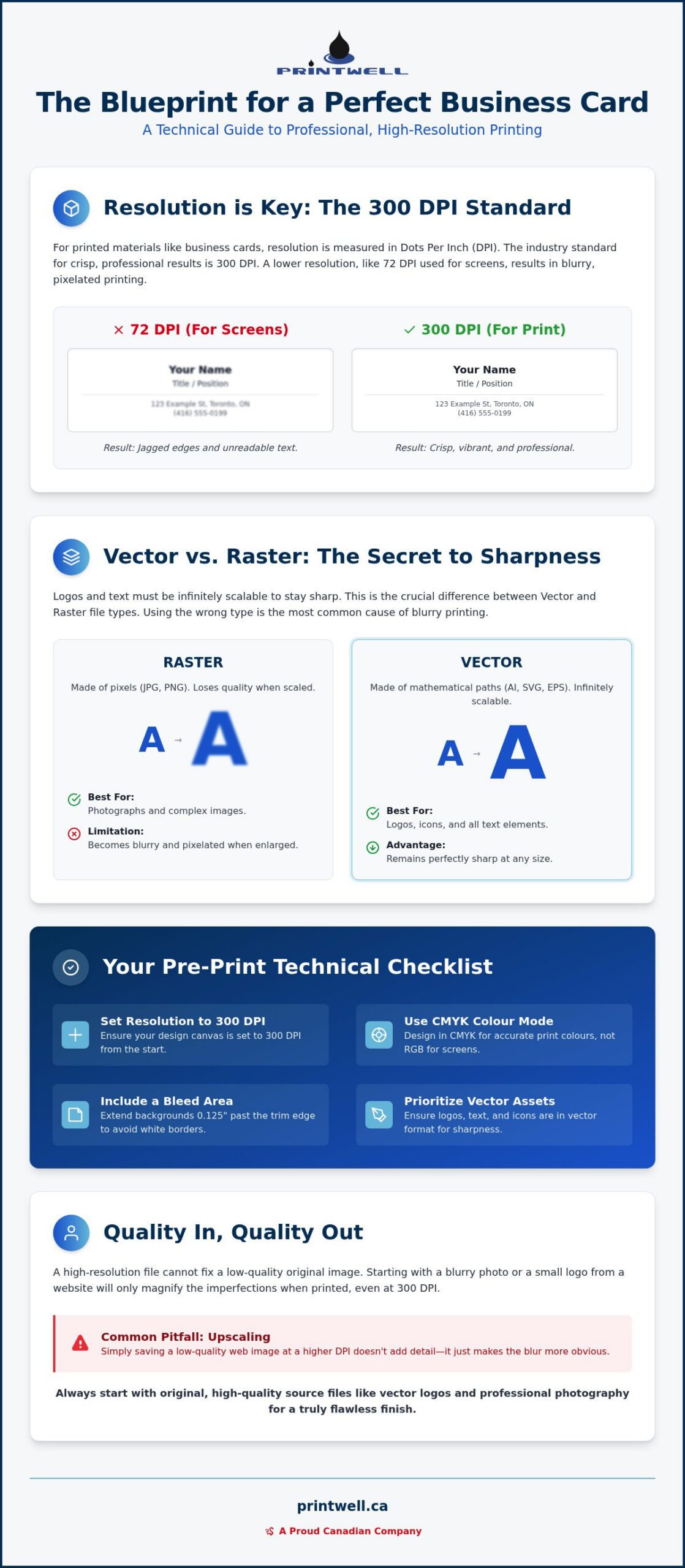
High resolution isn’t just a technical setting; it’s the difference between a card that commands respect and one that gets discarded. At its core, resolution refers to the density of detail within a printed image. We measure this in DPI, or Dots Per Inch. For high resolution business cards, 300 DPI is the non-negotiable industry standard. This number represents the technical blueprint that tells a printer exactly where to place every microscopic drop of ink. When you provide a file with enough data, you ensure your branding is sharp, legible, and professional.
Resolution matters because it prevents the common pitfalls of low-quality printing. Without a high pixel density, your logo might appear with jagged, “staircase” edges, and small contact details can become muddy and unreadable. A high-resolution file maintains the relationship between file size and physical dimensions. It allows the ink to sit exactly where it should, creating a clean finish that reflects your commitment to quality. It’s about taking pride in the small details so your clients can trust the big picture.
The 300 DPI Standard Explained
Digital screens and physical paper speak different languages. Most screens display images at 72 DPI, which is perfectly fine for a website but fails in a physical print environment. Because a printer packs dots much more tightly than a monitor packs pixels, a screen-ready image will look blurry once it hits the paper. You can check your current resolution in professional design software by looking at the image size settings or document properties. DPI serves as the bridge between digital pixels and ink droplets. Adhering to these Business card standards ensures that your design translates perfectly from your computer to the palm of your hand.
Resolution vs. Quality: Why Both Matter
It’s vital to realize that a high-resolution file cannot fix a low-quality original image. If you start with a blurry photo downloaded from social media, simply saving it at 300 DPI won’t add detail; it will only make the blur more obvious. True quality starts with using original “source” files, such as vector logos or high-resolution photography taken with a professional camera. This intentionality preserves the integrity of your branding. It ensures your high resolution business cards feel industrious, modern, and highly organized. By starting with the best possible assets, you guarantee a final print result that is crisp, vibrant, and durable. This approach saves time, reduces waste, and builds confidence in your professional identity.
Vector vs. Raster: The Secret to Infinite Sharpness
Designing high resolution business cards requires a clear understanding of how digital files translate into physical objects. While a design might look acceptable on your smartphone or laptop, the printing press is much less forgiving. To achieve a professional result, you must distinguish between raster and vector graphics. These two file types handle data differently, and using the wrong one for your logo or text is the most common reason cards return from the printer looking blurry or amateurish.
Raster images, such as JPG, PNG, or TIFF files, are composed of a fixed grid of pixels. They are ideal for complex imagery like photographs because they can capture subtle gradients and lifelike details. However, they have a significant limitation: they cannot be enlarged without losing quality. If you try to stretch a small raster logo to fit your card, the printer will simply see larger, blockier pixels. This results in the jagged edges and “muddy” appearance that every professional wants to avoid. For a result that is crisp, vibrant, and professional, you need a different approach for your brand assets.
Vector graphics are the secret to infinite sharpness. Instead of pixels, files like AI, EPS, or SVG use mathematical paths to define shapes. You can scale a vector logo from the size of a postage stamp to the size of a billboard, and it will remain perfectly sharp. This is why your primary logo and any icons should always be kept in a vector format. By using vectors, you ensure that every line is clean, every curve is smooth, and every corner is sharp. If you’re looking to refine your brand assets before printing, our Professional Printing Guide for Canadian Businesses offers deeper insights into managing these files effectively.
When to Use Raster Images
There are times when raster elements are necessary, such as when you include a professional headshot or a lifestyle photograph on your card. In these cases, the rule of 300 DPI becomes your best friend. You must ensure that your photo is high resolution at its final print size. Many people make the mistake of “upscaling” a low-resolution image in Photoshop, but this process only adds noise and digital artifacts rather than genuine detail. Start with the largest original file possible to maintain the visual integrity of your brand. If you need help verifying your file quality, you can always reach out to us for a quick check of your business card design before we head to the press.
The Power of Vector Typography
Text is where many designs falter. To maintain the highest possible clarity, your typography should remain as vector data. When you “outline” your fonts in design software, you convert the letters into mathematical shapes. This prevents the “fuzziness” often seen on home-printed cards and ensures that your contact information is easy to read, even at very small sizes. It creates a finished product that feels industrious, modern, and highly organized. By keeping your text and logos as vectors while reserving high-quality raster files for photography, you create a balanced design that stands out for all the right reasons.
How to Design for High Resolution: A Step-by-Step Guide
Designing high resolution business cards requires a shift in mindset from digital viewing to physical manufacturing. It’s a methodical journey that ensures your brand’s first impression is precise, vibrant, and professional. By following a structured workflow, you eliminate guesswork and build a file that any professional print shop can handle with ease. A well-prepared file ensures crisp text, vibrant logos, and a perfect trim. Follow these essential steps to prepare your design for the press:
- Step 1: Set your canvas size. Start with the standard North American dimensions of 3.5 by 2 inches. You must add a 0.125-inch bleed area to all four sides, making your total document size 3.75 by 2.25 inches.
- Step 2: Select the CMYK colour mode. Digital designs often default to RGB for screens. Switching to CMYK ensures the colours you see on your monitor closely match the physical ink used in production.
- Step 3: Define your Safe Zone. Keep all critical text and logos at least 0.125 inches inside the trim line. This prevents important details from being cut off during the final finishing process.
- Step 4: Prioritize high contrast. Use bold, clear colour combinations to ensure your contact information remains legible even at small font sizes.
- Step 5: Export as a Print-Ready PDF. Use the “High Quality Print” or “PDF/X-1a” preset. This format embeds your fonts and preserves your high resolution business cards at the required 300 DPI.
Understanding Bleed and Safety Zones
The “Bleed” is the area of your design that extends past the final trim line. It acts as a necessary margin for error when the cards are cut to size. If your background colour stops exactly at the edge, even a microscopic shift in the blade can leave an unsightly white sliver. Conversely, the “Safety Zone” protects your content. Keeping your phone number and email address centred within this zone ensures they stay safe from the blade. Visualizing the “Trim Line” as the final destination helps you organize your layout with confidence and intentionality.
CMYK vs. RGB: Achieving Accurate Colour
Achieving a “what you see is what you get” result requires using the CMYK colour model. While RGB uses light to create vibrant neons on a screen, printers use a mix of Cyan, Magenta, Yellow, and Black ink. This difference often causes bright blues and greens to look slightly duller once printed on cardstock. To maintain a vibrant look, choose colours specifically designed for print. This thoughtful approach prevents surprises and ensures your branding remains consistent across every marketing piece you produce.
Choosing the Right Paper for High-Impact Detail
The tactile experience of a business card is just as important as the visual design. While you have mastered the digital side of high resolution business cards, the paper you choose determines how that detail actually looks in someone’s hand. Paper texture directly influences how ink sits on the surface. If you choose a highly absorbent paper, the ink can spread slightly, causing fine lines to look softer. Conversely, a coated stock keeps the ink on the surface for maximum precision. It provides weight, texture, and professional authority.
Coated papers are generally the best choice for holding tiny text and intricate logos. They offer a barrier that prevents the wicking effect where ink bleeds into the paper fibres. Uncoated stocks are beautiful and feel organic, but they often require bolder designs to maintain clarity. If your brand relies on fine details, choose a stock that supports that level of intentionality. This ensures your first impression is crisp, professional, and perfectly aligned with your brand standards.
Matte vs. Gloss: The Resolution Trade-off
Choosing between matte and gloss is often a matter of brand personality. Glossy finishes make colours feel more vibrant and photos look significantly sharper. The reflective surface adds a layer of depth that enhances the perception of resolution. Matte finishes offer a sophisticated, glare-free look that is much easier to read under harsh office lighting. If you are balancing quality and budget, our guide on Affordable Business Cards in Canada provides a detailed comparison of these stocks to help you make the right choice.
Premium Stocks for Canadian Professionals
The weight of your card communicates reliability and strength. Most Canadian professionals choose between 14pt and 16pt stocks. A 16pt card is noticeably thicker, providing a durable, high-quality feel that doesn’t easily bend or fray. This is especially important in our diverse Canadian climate. From the humid summers in Southern Ontario to the dry, biting winters of the Prairies, your card needs to maintain its structural integrity. A flimsy card suggests a temporary business. A heavy stock suggests a permanent fixture in the community. It provides strength, resilience, and professional pride.
Textured papers like linen add a unique tactile element but come with a warning. The physical ridges of the paper can break up very fine high-resolution lines. If you love the feel of linen, keep your design simple and bold. To add extra impact without sacrificing clarity, consider specialty finishes like Spot UV. This process applies a glossy coating only to specific areas, such as your logo, making it catch the light while the rest of the card remains matte. It’s a modern way to highlight your craftsmanship and ensure your high resolution business cards truly stand out. Ready to see the difference for yourself? You can order your custom business cards today and experience the impact of premium Canadian printing.
Printwell Canada: Your Partner in Professional Printing
Choosing a partner for your printing needs is about more than just finding a machine; it’s about finding a team that values your vision. At Printwell Canada, we bring a Master Artisan’s touch to every project we undertake. We understand that high resolution business cards are the cornerstone of your professional identity, acting as a tangible reminder of your expertise. Our local Canadian expertise ensures that your branding meets national standards, providing a level of reliability and care that distant corporate entities simply cannot match. We take personal responsibility for every ink drop, ensuring your first impression is always sharp.
The Printwell Advantage
We offer a solution-oriented approach that sets us apart from automated online templates. If your file has resolution issues or colour concerns, we act as your friendly guide to help you fix them before they hit the press. We combine modern technology with traditional craftsmanship to create products that are built to last. For those who prefer a personal touch, you can visit our showroom to touch the paper, feel the weight, and see the colours in person. This tactile experience allows you to choose the perfect stock for your high resolution business cards with total certainty.
Ready to Elevate Your Branding?
Your journey from a digital design to a physical marketing tool should be seamless and rewarding. Business cards are the foundation of your promotional strategy, serving as the primary bridge between a digital connection and a real-world relationship. When you invest in high-quality printing, you are investing in the longevity of your brand. You can start your order with confidence, knowing that our team is dedicated to your success. Let us help you turn your high-resolution vision into a tangible reality that represents the very best of what you do. Contact us today to begin your next project with a partner you can trust.
Ready to Make a Lasting Professional Impression?
Mastering the technical side of print design ensures your branding remains sharp, legible, and professional. By prioritizing vector graphics, maintaining a 300 DPI resolution, and respecting the essential bleed and safety zones, you’ve laid a solid foundation for success. These steps prevent the common frustrations of blurry text or mismatched colours. You’ve done the hard work of designing with intentionality; now it’s time to bring that vision to life on premium paper.
Printwell Canada is here to help you cross the finish line with confidence. We offer expert file reviews to catch potential issues before they reach the press, ensuring your design is perfectly prepared. You can choose from our range of premium cardstock options to find the perfect tactile match for your brand’s identity. With reliable nationwide shipping across Canada, your new high resolution business cards will arrive ready to work as hard as you do. We take pride in our craftsmanship so you can take pride in your first impression. Order your high resolution business cards from Printwell Canada today and start networking with total peace of mind. We’re ready to help your business stand out.
Frequently Asked Questions
What is the best file format for high resolution business cards?
A high-resolution PDF with embedded fonts is the industry standard for high resolution business cards. This format preserves your vector paths, embeds your fonts, and protects your image quality. It ensures that the file we receive is exactly what you intend to see on paper, preventing any unexpected shifts in layout or typography during the production process.
Is 300 DPI enough for business card printing?
Yes, 300 DPI is the non-negotiable standard for professional printing. It ensures your branding remains sharp, legible, and professional. While higher resolutions are technically possible, the human eye rarely notices a difference on standard cardstock. Focusing on a clean 300 DPI file ensures your graphics remain crisp without creating unnecessarily massive file sizes that are difficult to process.
Why do my business cards look blurry when I printed them at home?
Home printers often lack the mechanical precision and ink density required for professional-grade results. Most consumer devices are calibrated for standard document printing rather than the high-impact detail needed for business branding. Additionally, home printers don’t handle heavy cardstock well, which often leads to ink saturation issues and a noticeable loss of clarity in your fine lines.
Can I use a photo from my phone for my business card?
You can use a phone photo if it was taken in high quality and hasn’t been compressed by an app. Modern smartphones take excellent photos, but you must use the original file rather than a version downloaded from social media. Always verify that the image remains at least 300 DPI at the specific physical size it will appear on your finished card.
What is the difference between CMYK and RGB for printing?
CMYK is the colour model for physical ink, while RGB is the model used for digital screens. Because printers use Cyan, Magenta, Yellow, and Black to create images, designing in CMYK prevents the unexpected colour shifts that happen when converting from the light-based RGB model. It’s the most reliable way to ensure your brand’s colours stay consistent, vibrant, and accurate.
How much bleed do I need for a standard business card?
You need a bleed of 0.125 inches on all four sides of your design. This small margin provides a necessary safety net for the cutting process, ensuring your background colour extends all the way to the edge. For a standard 3.5 by 2 inch card, your final file size should be set to 3.75 by 2.25 inches to accommodate this trim.
Can I convert a low-resolution image to high resolution?
No, you cannot effectively convert a low-resolution image into a high-resolution one. While software can add more pixels to a file, it cannot invent details that weren’t captured in the original shot. This process usually results in a pixelated or “fuzzy” look that undermines your professional image. It’s always best to start with high-quality source files from the beginning.
Do I need special software to design high resolution cards?
You don’t strictly need professional software, but tools like Adobe Illustrator or InDesign offer the most control over high resolution business cards. These programs allow you to manage bleeds, CMYK profiles, and vector paths with ease. However, many modern web-based tools can produce great results if you are careful to select the correct high-quality PDF export settings and maintain your 300 DPI standards.