
 A Proud Canadian Company
Did you know that over 90% of digital files submitted for professional printing contain at least one technical defect? It’s a staggering figure that represents billions of dollars in wasted materials, lost time, and missed opportunities. You likely started your project with a vision of vibrant custom hoodies, sharp business cards, or durable stickers, but the technical gap between a glowing screen and a physical press can be surprisingly wide. Avoiding common printing mistakes is not just about mastering software; it’s about protecting your investment, honouring your brand, and ensuring your message is delivered with precision.
We recognize how disappointing it feels to open a shipment only to find muddy colours, blurry logos, or designs that have been cut off at the edges. You want to feel certain that your files are correct, and you need a reliable workflow to guarantee success. This guide provides the clear, methodical steps required to prepare your designs for flawless results. We will walk through the essential standards for resolution, colour management, and safe zones to ensure your vision translates perfectly from your computer to the final product.
Key Takeaways
- Understand why vector files and 300 DPI resolution are essential for maintaining professional clarity on business cards, custom hats, and banners.
- Learn the vital steps for converting digital RGB designs into print-ready CMYK to ensure your brand colours remain consistent, accurate, and vibrant.
- Discover how to prepare specialized files for DTF stickers and embroidered hoodies by mastering transparency settings and minimum line weights.
- Protect your marketing budget and brand integrity by avoiding common printing mistakes that lead to costly reprints and shipping delays.
- Gain confidence in your workflow by applying a final pre-press checklist that catches spelling errors and edge-alignment issues before production begins.
The Hidden Costs of Common Printing Mistakes
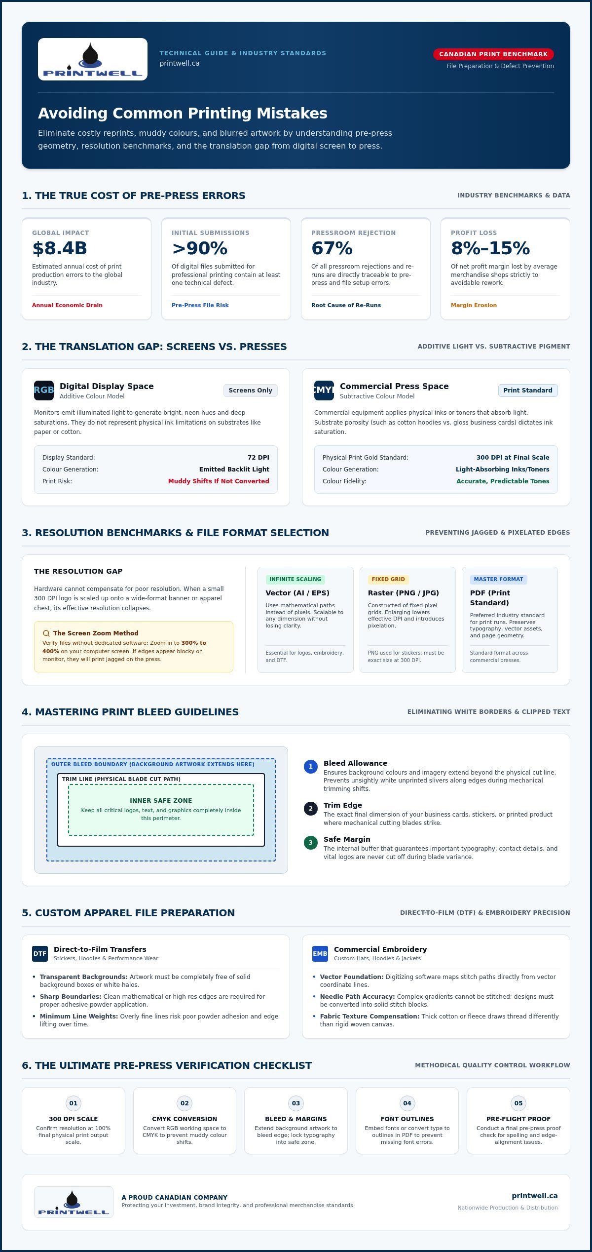
Errors in print production cost the global industry an estimated $8.4 billion annually. This staggering figure highlights a harsh reality for many Canadian businesses: a small oversight in a digital file can lead to a massive drain on resources. Research indicates that 67% of all pressroom rejections and re-runs are directly traceable to prepress and file preparation errors. When you consider that the average merchandise shop loses between 8% and 15% of its net profit margin to avoidable rework, it becomes clear that avoiding common printing mistakes is a critical financial strategy.
Beyond the immediate invoice for a reprint, poor-quality merchandise carries a heavy psychological weight. If your team receives custom hoodies with blurry logos or business cards with inconsistent colours, their morale takes a hit. They want to represent a brand that values quality, durability, and professional standards. When your branding looks different across various materials, it confuses your customer base. A customer who sees a vibrant sign but receives a dull, muddy-looking mug may begin to question your attention to detail. Professional printing is an investment in trust, and getting it right the first time protects your reputation.
Digital vs. Physical: The Translation Gap
The most frequent source of frustration is the gap between what you see on a backlit screen and what appears on a physical product. Your monitor uses an additive colour model, emitting light to create vibrant neons and deep saturations. Printing equipment uses a subtractive model, applying ink or toner that absorbs light. This fundamental difference means that “good enough” for a website is rarely sufficient for a large-format banner or a custom t-shirt. To prevent the frustration of white borders or cut-off logos, adhering to standard print bleed guidelines is a non-negotiable step for any professional project. Textures also play a role; ink sits differently on a porous cotton hoodie than it does on a sleek, gloss-coated business card.
Time Management in the Printing Process
Rushing a project is the fastest way to invite errors. Industry data suggests that over 90% of submitted print files contain at least one technical defect, such as missing bleeds or low resolution. These issues are often the result of last-minute rushes where the proofing process is bypassed to meet a deadline. We advocate for a “slow down to speed up” approach. By setting realistic timelines for file preparation, production, and nationwide shipping, you allow for a thorough pre-flight check. This methodical pace ensures your branded apparel looks professional, your files are processed correctly, and your project stays on budget. Taking an extra hour to verify your artwork can save you days of waiting for a corrected reprint.
Resolution and File Formats: Eliminating Pixelation
Hardware alone cannot compensate for a low-resolution source file. Even the most advanced commercial press will produce jagged, blurry results if the digital foundation is weak. Avoiding common printing mistakes starts with understanding DPI (Dots Per Inch). While 72 DPI is standard for web browsing, 300 DPI at the final output scale is the industry gold standard for physical merchandise. If you provide a small logo at 300 DPI and try to scale it up for a banner, the effective resolution drops significantly, leading to visible pixelation. You can check your resolution without expensive software by zooming into your design to 300% or 400% on your screen; if the edges look blocky there, they will look blocky on your final product.
Choosing the right file format is equally crucial for your project’s success. Portable Document Format (PDF) is the preferred standard for most print jobs because it preserves fonts and layouts. However, for logo work, Adobe Illustrator (AI) or EPS files are superior because they contain vector data. Unlike raster files, such as PNG or JPG, which are made of fixed pixels, vector file formats use mathematical paths to define shapes. This allows them to be scaled to any size, from a business card to a billboard, without losing a single ounce of clarity. For projects requiring transparency, such as stickers, a high-resolution PNG is often necessary, but it must be created at the correct physical size from the start.
The Vector Advantage for Apparel
Vectors are particularly vital for custom apparel. Embroidery machines and Direct-to-Film (DTF) printers require clean, defined edges to translate digital art into physical stitches or films. A vector logo ensures the needle path or the adhesive powder application is precise. If you only have a raster file, you may need to have it professionally redrawn to meet these technical thresholds. Ensuring you have a vector version of your logo is a proactive way to maintain branding consistency across all materials, from embroidered hats to printed hoodies. It’s the best way to ensure your custom t-shirts look as sharp as your digital brand identity.
Avoiding the “Internet Image” Trap
It is tempting to grab a logo from your company’s social media page or website, but these files are heavily compressed for speed. Saving an “internet image” usually results in a file too small for high-quality printing. Upscaling these files in software doesn’t add detail. It simply creates “artifacts” or muddy patches where the computer tries to guess the missing pixels. Effective resolution is the final pixel density of an image after it has been scaled from its digital dimensions to its full, physical print size. To ensure professional results, always source original, high-resolution assets rather than relying on web-optimized versions.
Mastering Colour Space and Bleed Zones
Opening a box of custom merchandise only to find your vibrant digital designs have turned dull and muddy is a frustrating experience. This shift usually happens because of a fundamental mismatch between screen light and physical ink. Screens operate in RGB (Red, Green, Blue), while professional presses use CMYK (Cyan, Magenta, Yellow, Key/Black). Avoiding common printing mistakes requires you to convert your files to CMYK before submission. Vibrant neons and electric blues often fall outside the “printable gamut,” meaning they cannot be reproduced with standard inks. The Library of Congress provides detailed digital image specifications regarding colour profile embedding to help you maintain high-fidelity results during this transition.
Precision in avoiding common printing mistakes also involves mastering the physical boundaries of your canvas. The “Bleed” is the area of your design that extends past the final trim line. Without it, slight shifts during the cutting process can leave unsightly white slivers along the edges of your business cards or signs. Equally important is the “Safety Zone,” which is the inner margin where all critical text and logos must live. Keeping your essential elements at least 0.125 inches away from the trim line ensures they won’t be accidentally clipped by the guillotine blade during the final finish.
Setting Up Your Canvas for Success
To prepare a flawless file for business cards or marketing collateral, start by adding a 0.125-inch bleed to all four sides of your document. This effectively adds 0.25 inches to both your total width and height. When organizing your layers, ensure your background images or solid colours stretch all the way to this outer edge. You should also include “Crop Marks” in your final PDF export. These small lines sitting outside the bleed area communicate exactly where the cut should occur, providing clarity, reliability, and precision for your print provider.
Colour Consistency Across Different Media
It is a common surprise to find that embroidered hoodies look slightly different than custom mugs or signs. Each material, or substrate, absorbs and reflects light differently. Thread has a natural sheen that ink on ceramic does not possess. To achieve the best results, choose “print-safe” colours that are less prone to dramatic shifts. For those maintaining a professional office environment, using high-quality ink & toner refills is essential for producing accurate internal proofs. Seeing a physical draft on paper allows you to catch colour conflicts early, providing a clear path toward a successful final run of promotional products.
Custom Apparel Mistakes: DTF and Embroidery Prep
Apparel customization requires a different technical mindset than paper printing. Fabric moves, stretches, and absorbs ink in ways that cardstock simply doesn’t. Avoiding common printing mistakes in this category means respecting the physical limits of threads, films, and fabrics. Whether you are ordering embroidered hoodies or custom hats, the substrate dictates the design. A logo that looks sharp on a business card might lose its impact when translated into thousands of individual stitches or a heat-pressed transfer. Proper preparation ensures your brand remains legible and durable through every wash.
Designing for the Stitch
Embroidery is a form of craftsmanship that relies on physical thread, not digital pixels. Because a needle has a fixed thickness, it cannot render microscopic details or smooth gradients. Small text is the most frequent casualty of poor preparation. For clean, legible results, sans-serif block lettering should be at least 0.25 inches (6.35 mm) tall. If your brand uses complex scripts or serif fonts, you should increase that height to 0.35 or 0.50 inches to prevent the letters from distorting. Simplifying your logo by removing thin lines leads to a more premium-looking embroidered hoodie that stands the test of time. For a deeper look at these techniques, consult The Power of Custom Embroidery.
Direct-to-Film (DTF) Best Practices
Direct-to-Film (DTF) technology offers incredible versatility for multi-colour designs, but it introduces its own set of challenges. One major pitfall is the “white box” effect. This happens when a designer submits a file with a solid background instead of a transparent one. To avoid this, always provide 300 DPI transparent PNGs. Additionally, be wary of semi-transparent pixels or soft glows. DTF white underbases cannot print beneath opacities below 20% to 25%, which creates a harsh, jagged edge rather than a soft fade. Review our Complete Guide to DTF Gang Sheet Printing to master these technical layout rules.
Consider how the base garment colour influences the final appearance of your design. Dark fabrics can sometimes “bleed” through thin layers of ink if an underbase isn’t correctly applied. By avoiding common printing mistakes like ignoring fabric-to-ink interaction, you ensure your colours pop regardless of the shirt’s shade. Optimizing your layout is also a matter of efficiency. Ensuring your gang sheets are organized with at least 0.5 mm of space between designs prevents waste. Minimum line weights must be at least 0.5 mm so the adhesive powder has enough surface area to bind. If you’re ready to start your next project, you can order your custom apparel with confidence knowing your files are prepared for the press.
The Ultimate Pre-Press Checklist for Flawless Results
The final moments before you click “upload” are the most critical for avoiding common printing mistakes. Even the most stunning design can be undermined by a simple typo or a missing font. This is the stage where you transition from creator to inspector, ensuring every technical detail we have discussed is locked into place. Establishing a methodical final review is the best way to protect your marketing budget and ensure your custom merchandise arrives looking exactly as you imagined. It is the final barrier between a successful project and a costly waste of materials.
One of the most effective techniques is the “Three-Inch Rule.” By viewing your design at 100% zoom on your monitor, you are seeing the artwork at its actual physical size. This allows you to catch small imperfections that are invisible when the design is shrunk to fit your screen. During this review, you must perform a manual spell check. Never trust your own eyes when it comes to your own phone number, email address, or website URL; our brains often “fix” familiar errors automatically. Read these critical details backward, or ask a colleague to verify them, to ensure your contact information is perfect.
Typography requires special attention during the final save. If your printer does not have your specific, unique font installed, their system may revert your text to a generic font like Arial, which can ruin your layout. To prevent this, always convert your text to “outlines” or “paths.” This process turns your letters into mathematical shapes, ensuring your branding remains intact regardless of the software used to open the file. Finally, use clear file naming conventions. Including the project name, physical dimensions, and the word “FINAL” helps your printer organize your order and reduces the risk of the wrong version reaching the press.
The 5-Minute Final Review
Before exporting your final PDF, run through these three essential technical checks to guarantee high-resolution output:
- Verify Resolution: Ensure your file is set to 300 DPI at the final output scale to prevent pixelation.
- Confirm Outlines: Select all text and convert it to paths so your typography never shifts or disappears.
- Check Colour Mode: Confirm that your entire document is in CMYK mode to maintain colour accuracy across all promotional products.
Partnering with a Professional Service
Even with a perfect file, having a seasoned expert on your side provides an invaluable safety net. A professional printing service in Canada does more than just run machines; they act as a final set of eyes to catch potential issues before production begins. We highly recommend requesting a digital or physical proof for large orders. This allows you to verify the feel of the fabric, the vibrance of the ink, and the placement of your logo in the real world. This methodical approach ensures that avoiding common printing mistakes becomes a natural part of your creative process. Ready to start? Explore our professional printing services at Printwell Canada and let us help you realize your branding goals with precision and pride.
Bring Your Branding Vision to Life with Confidence
Mastering the technical details of file preparation is the most effective way to protect your marketing budget and your brand reputation. By prioritizing high-resolution vector files, adhering to precise bleed zones, and respecting the physical limits of embroidery, you ensure your merchandise reflects the quality of your business. Avoiding common printing mistakes isn’t just about technical accuracy; it’s about taking pride in craftsmanship and ensuring your message is delivered with clarity and impact.
A methodical workflow combined with the right partner turns a complex process into a seamless success. At Printwell Canada, we act as your master artisans and friendly guides. We specialize in high-quality DTF transfers and premium embroidery, providing the expertise needed to catch errors before they reach the press. With our showroom available for physical quality assurance and fast turnaround times, we make professional branding accessible to every Canadian business. It’s a reliable, straightforward approach that allows you to focus on your goals while we handle the production details.
Realize your vision with Printwell Canada’s expert printing and embroidery services and enjoy nationwide shipping across Canada. We are ready, capable, and eager to help you create something exceptional.
Frequently Asked Questions
What is the most common mistake people make when ordering custom t-shirts?
The most frequent error is submitting low-resolution images pulled from social media or websites. These files are compressed for digital speed and lack the density needed for physical printing. When scaled to fit a chest print, they become blurry and pixelated. Ensuring you use a high-resolution source is a vital step in avoiding common printing mistakes. Always start with the original digital asset to maintain professional clarity.
Why do the colours on my printed business cards look different than on my phone?
Your phone screen uses an additive RGB colour model that emits light to create vibrant, neon shades. Physical printing uses a subtractive CMYK model, applying ink that absorbs light. This technological difference means certain bright greens and deep purples cannot be replicated perfectly with toner. You can bridge this gap by converting your design to CMYK before uploading to ensure your business cards match your expectations.
Can I use a photo from my smartphone for a large custom banner?
Most modern smartphone photos are suitable for small prints, but they often lack the effective resolution required for large-scale signs and banners. A photo that looks sharp on a five-inch screen will likely appear grainy when stretched to several feet. For professional results on large displays, we recommend using high-resolution files or vector graphics that maintain their integrity regardless of the final output size.
What happens if I don’t include a bleed in my print file?
Omitting a bleed often results in unsightly white slivers along the edges of your finished product. During the final trimming process, paper can shift slightly under the guillotine blade. If your design doesn’t extend past the trim line, those tiny movements expose the unprinted paper underneath. Including a standard 0.125-inch bleed ensures your background colour or image remains consistent right to the very edge of your card.
Is a PDF better than a JPEG for professional printing services?
A PDF is generally superior because it preserves your layout, fonts, and vector paths without compression loss. While a JPEG is a flattened raster image that can lose quality each time it is saved, a PDF acts as a high-fidelity container for all your design elements. Using a PDF/X-4 standard is a proven method for avoiding common printing mistakes like missing fonts or shifted text during production.
How do I know if my logo is a vector or a raster file?
Identify the file type by performing a simple zoom test on your computer. Open the file and zoom in to 400% or higher. If the edges of your logo remain perfectly smooth and sharp, it is a vector file. If the edges look blocky, jagged, or blurry, you are looking at a raster file. Vector files are essential for scalability on items like custom hats and signs.
Why is 300 DPI so important for custom merchandise?
300 DPI (Dots Per Inch) is the industry gold standard because it provides the density required for the human eye to perceive a continuous, sharp image. Lower densities, like the 72 DPI used for websites, result in visible dots and fuzzy edges when printed. Maintaining this high standard ensures your custom mugs and promotional products look professional, crisp, and high-end rather than amateur or rushed.
Can embroidery reproduce very fine details from my digital design?
Embroidery is limited by the physical thickness of the thread and the needle. Very fine details, microscopic text, or complex gradients often become muddy or lost during the stitching process. To ensure your embroidered hoodies look their best, we suggest simplifying your logo and ensuring all text is at least 0.25 inches tall. This practical approach allows the machinery to create clean, durable, and premium-looking results.