 A Proud Canadian Company
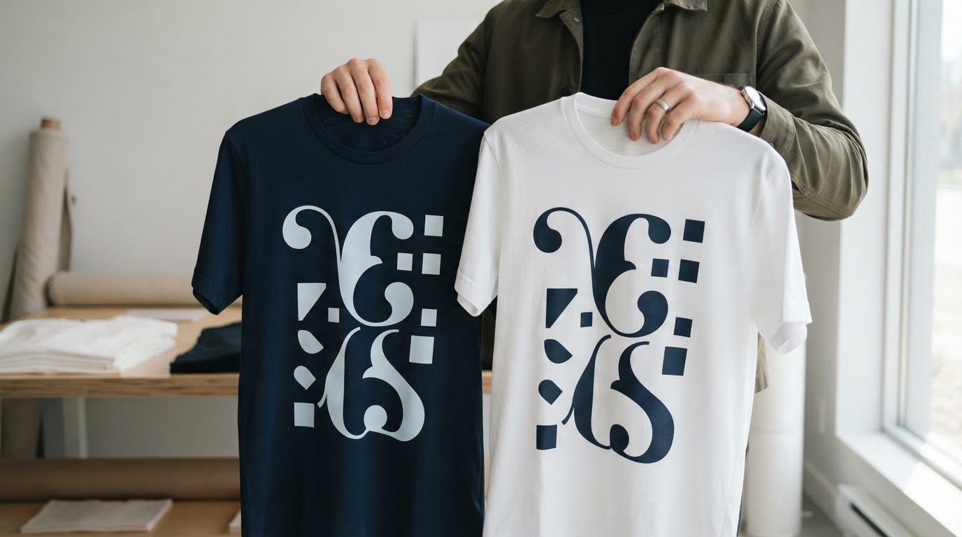
The boldest font isn’t always the one that makes a T-shirt design stand out. A thoughtful font pairing for custom apparel creates contrast between the main message and supporting text, giving each room to be seen and read.
A font’s personality matters, but style alone can’t carry a design. Lettering also needs to stay clear at the printed size, work with the garment colour, and suit the mood you want to create. A script headline can feel warm and personal, while a simple sans-serif keeps a tagline readable and balanced.
This guide covers pairing serif, sans-serif, script, and display fonts, then using size, spacing, and colour contrast to build visual hierarchy. You’ll also find practical combinations for different looks and tips for choosing lettering that stands out on light or dark apparel. The goal is simple: make the message easy to notice without crowding the design.
Key Takeaways
- Pair fonts with noticeably different styles, such as a serif headline and a sans-serif tagline, to give each part a clear role.
- Use text size and spacing to guide the eye from the main message to supporting details.
- Choose a distinctive display font for short headlines and a simpler body font for longer text.
- Keep playful or decorative lettering balanced with clean, easy-to-read supporting text.
- On dark garments, favour sturdy letter shapes and enough space between strokes to help details remain clear.
1. Should I use serif or sans-serif fonts for T-shirt text?
Pair a serif with a sans-serif when you want contrast without competing styles. Serif letters have small finishing strokes that can feel traditional or elegant; sans-serif letters lack those strokes and often look clean and direct. For example, Merriweather can give a headline a classic feel, while Roboto keeps supporting text simple. Give each font a clear role, such as a short serif headline and a sans-serif tagline.
Curated pairings are a useful starting point. Pacifico, a flowing script, and Montserrat, a geometric sans-serif, create a relaxed headline with crisp supporting text. Raleway and Open Sans suit a more minimal look, while Roboto and Merriweather balance contemporary and traditional character. Treat these as examples, not formulas: the wording, print size, and garment colour all affect the result. Stick to a headline style and a supporting style to keep the design organized.
Retro lettering can work well for an event or team design when paired with a more current, straightforward font. A rounded vintage-style headline with Montserrat, for instance, suggests a throwback mood without making every line feel dated. Reserve the retro font for a few key words, then use the simpler face for dates or details. Intricate scripts also need enough space between letters; tight strokes can blur together on fabric.
For commercial custom apparel in Canada, follow the font’s licence terms. Check that they permit commercial use on physical products, including apparel, and cover the way the lettering will be reproduced. A downloadable font file doesn’t automatically permit every use.
How much does a commercial font licence cost for an apparel brand? There’s no single fee for every font. The creator sets the licence terms, and the cost can depend on the permitted use and scope. Review each font’s terms before using it on products for sale.
2. Creating visual hierarchy through contrast
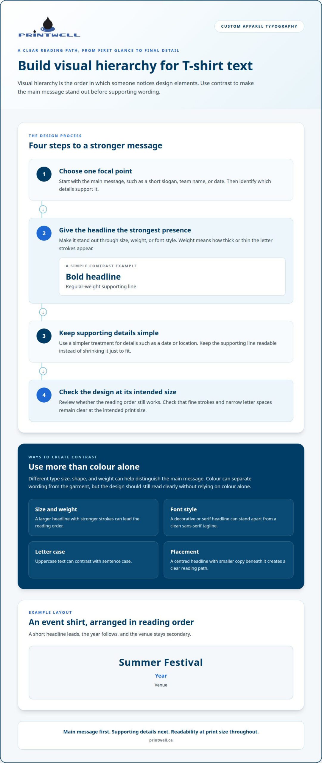
Visual hierarchy is the order in which someone notices design elements. On a T-shirt, the main message should catch the eye before supporting wording, such as a team name or event detail. Contrast creates that order: a larger headline beside smaller text makes the information priorities clear. If every word has the same size, weight, and placement, the design gives readers fewer cues.
Start by choosing one focal point, such as a short slogan, team name, or date. Set it larger than the supporting copy, then strengthen the distinction with a different font style or weight. Weight refers to how thick or thin the letter strokes appear. For example, a bold headline above a regular-weight tagline creates contrast without adding another font. Keep the supporting line readable instead of shrinking it just to fit.
Font combinations can build hierarchy by giving styles distinct roles. Six Caps paired with Archivo Narrow uses three styles to signal different levels of information. One can carry the headline, another highlight a key phrase, and a third handle secondary details. Six Caps is condensed, meaning its letters are narrow, so it can make a short heading prominent while using less horizontal space. Give each style a purpose rather than applying all three equally.
Contrast isn’t limited to type size. A decorative or serif headline can stand apart from a clean sans-serif tagline, while uppercase text can contrast with sentence case. Placement matters too: a centred headline with smaller copy beneath it creates a clear reading path. Use colour contrast to separate wording from the garment, but don’t rely on colour alone. The size, shape, and weight of the letters should still distinguish the main message if viewed from a distance or in a quick glance.
- Write the main message first, then identify which details support it.
- Make the headline the strongest element through size, weight, or font style.
- Use a simpler treatment for secondary details, such as a date or location.
- Review the design at its intended size to see whether the reading order holds.
For example, an event shirt could give “Summer Festival” the largest type, place the year below it, and keep the venue in a smaller style. That arrangement creates a clear sequence without crowding the print. A considered layout can carry through to custom T-shirt printing, where the hierarchy helps the message read as intended.
3. Display and body font combinations
A display font is designed to attract attention in a short headline, while a body font handles smaller supporting text. For a font pairing for custom apparel, give each typeface a clear role: use the display face for a brief slogan, then the body font for a name, location, or other detail. Playfair Display with Lato, for example, pairs a refined headline style with a clean, practical companion.
For a classic, clean design, choose fonts with different roles but compatible letter shapes. Oswald paired with Source Serif 4 can give a headline presence while keeping longer wording readable. Oswald’s strong, narrow appearance adds structure; Source Serif 4 brings a more traditional character. Keep the headline short and place supporting copy on a separate line, so the two styles don’t compete for attention.
Manufacturing designs often need to communicate a trade, company name, or product type quickly. Bebas Neue and Montserrat offer one approach: use Bebas Neue for a concise shop or service heading, then Montserrat for a secondary line, such as a department or location. Simple graphics, such as a rule aligned with the heading, can reinforce the layout. Keep lettering and shapes distinct, especially in a multicolour design.
For an industrial look, pair a bold, condensed display face with a straightforward sans-serif. Oswald and Raleway create that contrast: set a short workwear slogan in Oswald, followed by a smaller company or crew name in Raleway. Avoid pairing narrow fonts with similar shapes, as they can feel cramped. Thin strokes may also lose definition when reduced. A small test layout in a design tool can reveal crowded letters before you prepare the artwork.
A bike shop design can balance energy and clarity with a strong headline and an uncomplicated supporting font. Try Bebas Neue for a short phrase such as “Ride Together,” with Montserrat for a club name or event detail. Angled lines or a simple wheel-inspired graphic can reinforce the cycling theme without adding another type style. Keep graphics clear of letter strokes so they don’t obscure the wording.
Which font combinations are easiest to read on apparel? A distinct display font with a clean companion, such as Oswald and Source Serif 4 or Bebas Neue and Montserrat, makes the two text roles easy to distinguish. Check the design at its intended size and against the garment colour, since fabric contrast affects how clearly each line appears.
To choose a font pairing for custom apparel, assess the complete design rather than judging font samples alone. Check that the headline, smaller details, and graphics each have a clear role. If two styles compete for attention, simplify one. If narrow letters feel crowded, adjust their spacing or choose a more open face.
4. Funky headers paired with clean body text
A playful headline can make a shirt feel energetic, but supporting words still need to be easy to read. Pair a rounded display face with a clean font such as Open Sans: the heading sets a light mood, while the body text keeps names or event details clear. Bubblegum Sans with Open Sans is one example. Reserve the unusual style for the headline so the design doesn’t feel busy.
Geometric fonts, built from clean shapes and even lines, can give a friendly design a modern look. Montserrat paired with Karla balances structured headings with approachable supporting text. Try Montserrat for a short club or event name, then use Karla for a location or tagline. A simple body style is easier to scan than two decorative fonts together.
Rounded letters can suit event announcements because their soft shapes create a lively mood. For example, use a rounded headline for “Community Picnic” and a crisp sans-serif for the date and venue. Put the secondary information on its own line instead of weaving it through decorative letters. This gives each part space and keeps the key details clear at a glance.
Letter spacing is the space between characters. Increasing it slightly can improve readability, especially in all caps, where tightly packed letters may look crowded. Six Caps is a condensed display font, meaning its letters are narrow, and can work well for short headings. Pair it with a more open, straightforward font for supporting text instead of setting every line in condensed capitals.
Placement and scale matter as much as font choice. A left-chest design should be 3.5 to 4 inches wide, while a full-front design should be 10 to 12 inches wide. For a full-front layout, place the design around 2 inches below the collar line. These measurements give the lettering a defined area, helping a stylized heading and crisp supporting copy stay balanced on the garment.
How can you test a font pairing on an apparel mockup before production? A mockup is an on-screen preview of a design on a garment. Place the artwork on the intended shirt shape and colour, then view it at its planned size. Check that the heading reads first, small letters remain distinct, and spacing looks even. A close view can reveal crowded strokes, while a full view shows whether the design stands out from a normal viewing distance.
For a final check, review the complete graphic rather than isolated font samples. Make sure the headline, supporting details, and any decorative shapes each have a clear purpose. A simple, readable layout can then carry through to custom T-shirt printing.
5. Typography considerations for dark garments
On a dark garment, the letter colour needs to contrast with the fabric. Choose colours that make the wording distinct from the background, then check whether fine details in the typeface remain visible. A bold, modern pairing such as Oswald with Raleway gives a statement a structured look while keeping secondary wording straightforward. Use Oswald for a short headline and Raleway for a supporting line or name.
Screen printing transfers ink through a mesh screen onto fabric. Dark garments need a white-ink underbase, a layer beneath the main design colours, before those colours are applied. The underbase can slightly thicken fine lines, so ultra-thin script swashes and hairline serifs may snap, lift, or disappear during screen printing. Give decorative strokes more room, or choose sturdier lettering for key wording.
Pay attention to the gaps between letters, too. Heavy ink can spread into narrow spaces, causing letters to bleed together or fill in. A tightly drawn script may look elegant on a screen but lose definition on fabric. Try a simpler script for a short name, then pair it with an open sans-serif for supporting text. Check that the smallest text retains visible counters, the enclosed spaces inside letters such as “a” and “e.”
Typography should establish the identity you want the garment to convey. A community group might choose friendly rounded lettering, while a modern clothing label may prefer a geometric sans-serif. For a music-zine look, combine a rough, expressive headline with plain supporting text and deliberately uneven placement. A zine is a small, independently produced publication. Its collage-like style can inspire apparel graphics, but the main words still need clear shapes.
Form and function can work together. Start with the message, then match the type style to its purpose. A short slogan can use a distinctive display face, while a longer name or location benefits from simpler lettering. On a dark hoodie, for example, keep a bold headline prominent and use a clean typeface for smaller details. The visual character should support the information, not obscure it.
- Choose strong letter shapes for the most important words.
- Leave space around fine script strokes and narrow letter gaps.
- Check the design against the garment colour, not a white screen.
- Use a simple supporting face to balance a more expressive headline.
A mockup can show whether dark fabric overpowers thin lettering or reduces colour contrast. Review the design at its intended size, paying attention to small text, delicate strokes, and spaces within letters. These checks help retain the chosen style while keeping the final message easy to read.
Printwell Canada
Printwell Canada brings considered typography to custom apparel, including Custom T-Shirts, Embroidered Hoodies, Custom Hats, and DTF Stickers and Films. Once you’ve chosen the message, type styles, and garment colour, these products help carry a clear visual direction across different items. A pairing that reads well on a shirt can also guide a hoodie or hat design, with the layout adjusted for each piece.
If your design is ready, or you’re deciding how its lettering should look on apparel, contact Printwell Canada to discuss your project.
Put your apparel idea into motion
A strong type choice can do more than decorate a garment. It can help a group feel connected, give an event a recognizable look, or make a short phrase memorable. As you refine your font pairing for custom apparel, think about where people will wear the piece and what you want them to remember. That purpose can guide decisions about wording, placement, and overall style.
Printwell Canada offers Custom T-Shirts, DTF Stickers and Films, and Embroidered Hoodies to bring apparel ideas to life. Share your message and the look you want to create. A clear starting point helps turn a typography concept into a finished piece that feels intentional.
Contact Printwell Canada about your apparel to discuss your project. Your idea is ready for its next step.
Frequently Asked Questions
How can I make sure my font choice stands out on a T-shirt?
Make the main phrase distinctive and keep secondary wording easy to scan. For a volunteer group shirt, a short team name can take the lead, with a smaller role or location beneath it. Check the design against the shirt colour and see how it reads from a few steps away. If lettering competes with an illustration, simplify the graphic or give the words more space.
How can I pair fonts effectively?
Give each typeface a different role, such as headline or supporting line, and make the styles clearly distinct. For a school fundraiser, a lively headline could sit above a plain event name or date. Keep the pairing consistent across the artwork instead of changing fonts for every word. Before finalizing, read the text in order and check that the key information is easy to find.
Should I use serif or sans-serif fonts for T-shirt text?
Either can work; choose according to the design’s mood and the wording’s size. A serif can give a book club shirt a thoughtful, traditional character, while a sans-serif can suit a recreation team’s direct, modern look. If the design includes a headline and practical details, use the styles for different roles. Keep smaller wording straightforward so names and event information remain legible.
Which fonts should I avoid to prevent printing issues?
Avoid typefaces with extremely thin strokes, tight letter gaps, or intricate flourishes when the design relies on small text. On a staff shirt, for example, a narrow decorative font may make a long department name hard to distinguish. Screen printing generally needs thicker lines and wider letter spacing for clarity. Review small letters, punctuation, and enclosed spaces in the final artwork, not just the headline.
What fonts pair well for custom apparel designs?
Pair a distinctive headline face with a simpler companion that suits the message. For a polished fashion or lifestyle design, Yeseva One with Josefin Sans offers contrasting character and clean supporting text. For a technology club, Syne with Inter can create a more contemporary impression. Treat each combination as a starting point: the wording, garment colour, and amount of text all shape the result.
What are popular font pairing examples for custom clothing?
Quicksand Bold with Quicksand Regular creates contrast while keeping a consistent, playful style. For a technical or pixel-inspired graphic, DotGothic16 with Space Mono gives the headline a retro digital feel and the supporting words a matching foundation. These examples can suit casual club or event apparel. Use the more expressive face for the shortest wording, then let the companion font handle details that need quick reading.
How do font choices affect screen printing, embroidery, and heat transfer?
Each printing method reproduces artwork differently, so small details need attention. Screen printing generally needs thicker lines and wider spacing; embroidery forms letters with thread, making intricate shapes harder to keep distinct. Direct-to-Film, or DTF, transfers printed artwork from film onto fabric. With any method, simplify tiny flourishes and review the artwork at its intended size before production.
What fonts suit different apparel styles, audiences, and brand identities?
Match the type style to the people wearing the garment and the impression you want it to leave. A youth sports team might use energetic, rounded lettering, while a professional association could favour a restrained, structured face. A community arts event has room for more expressive typography, especially in a short title. Keep longer names, dates, or instructions in a clear companion style so the design stays practical.